Page 2 of 2
RE: The 5 zoom levels
Posted: Sun Dec 06, 2009 9:25 am
by Joshuatree
"90% are obvious but a couple i'm not sure of .i.e the last one looks like 2 men with a wheely bin"
LOL, you're right, it *does* look like a wheely bin!
And I have trouble distinguishing between Panzers also, or are they also specified?
RE: The 5 zoom levels
Posted: Sun Dec 06, 2009 12:13 pm
by PyleDriver
The last icon are support troops... You get to learn the icons as you play...
RE: The 5 zoom levels
Posted: Sun Dec 06, 2009 12:14 pm
by Lützow
ORIGINAL: Helpless
What you see is the smallest possible 1024x768 by Jon. It is not that massive at all on high res
Yeah, but I'm watching these screens (and those 1024x1280 ones at Typhoon thread) in 1920x1200 and this gives me a good estimate how the game will look on my monitor. Button size seems to be similiar as in WbtS but unlike there we have two rows here plus an aditional tab bar on top. Altogether this takes too much room and so does the counter depiction at side bar. If you can't work it into some kind of fly-out menu, scale down the buttons to dimensions of Panzer Campaigns or WitP. It will be still easy recognizable with the according tooltip.
Take this as constructive criticism, please. We all want WiTE to become a winner.
RE: The 5 zoom levels
Posted: Sun Dec 06, 2009 12:22 pm
by Zovs
Thanks for the screen shots. As I posted elsewhere I am so looking forward to this game.[/align]
RE: The 5 zoom levels
Posted: Sun Dec 06, 2009 1:18 pm
by Helpless
Yeah, but I'm watching these screens (and those 1024x1280 ones at Typhoon thread) in 1920x1200 and this gives me a good estimate how the game will look on my monitor. Button size seems to be similiar as in WbtS but unlike there we have two rows here plus an aditional tab bar on top. Altogether this takes too much room and so does the counter depiction at side bar. If you can't work it into some kind of fly-out menu, scale down the buttons to dimensions of Panzer Campaigns or WitP. It will be still easy recognizable with the according tooltip.
Take this as constructive criticism, please. We all want WiTE to become a winner.
Overall it is matter of taste. We have people asking to support high DPI fonts.
To be honest I had similar opinion while back. Especially regarding the side bar. But then so many info was put in there so there is barely enough space for that.
TopMenu bar is just 135 pixels which is very minor part in case of 1000+ y resolution. Changing current layouts would be close to impossible due to the amount of work required. But, luckily we are not fixed to 1024x768 as in WITP. There are various options which would make browsing and scaling fast and efficient.
Here is my 1680x1000 (minus Win7 task bar).

RE: The 5 zoom levels
Posted: Sun Dec 06, 2009 2:03 pm
by Crimguy
ORIGINAL: Lützow
I know it's still Alpha and visuals are subject to change, but someone has to say it:
Map and counters look nice, but the UI is way to obstrusive. Scale down the tripartite menu bar please, make fonts smaller and add either transparency or artwork to window backgrounds. Right now I feel being strucked from massive grey blocks.
As someone who has been suffering with WitP's interface since 2004, PLEASE keep the buttons etc. big enough to make it easy to quickly click them. I do agree that there has to be some attempt to minimize the amount of space wasted by the interface though. That's why I'm a fan of slide-out drawer style interfaces. Keep the data etc. hidden until needed.
Regarding the screenies, the interface looks nice to me! I can't judge the size very well in the pics though my first insince is to agree that the F-number icons are just slightly too large. I'd keep them the same height as the Windows toolbar.
I love the map and love the counters - the counters look like TOAW's but more modern. The UI looks very smooth too. Hats off to the graphics guys.
RE: The 5 zoom levels
Posted: Sun Dec 06, 2009 2:07 pm
by Helpless
Keep the data etc. hidden until needed.
Side bar is hidden until you select the unit or the stack. Also you may change the delay of mouse over text popups or switch them off if you wish..
RE: The 5 zoom levels
Posted: Sun Dec 06, 2009 5:46 pm
by thackaray
I love the maps and the information given in the screenshots.
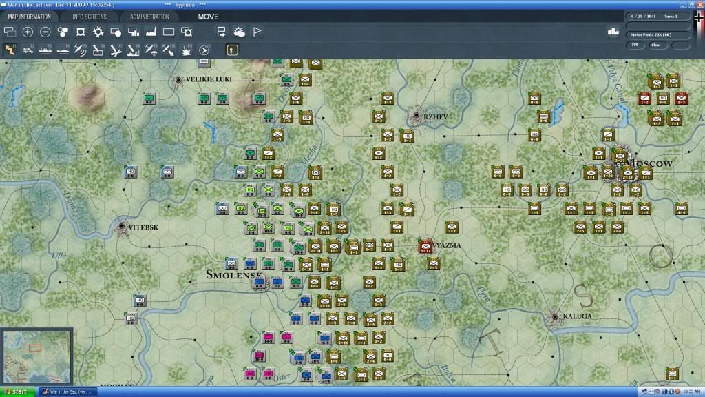
I'm just wondering in some of the screenshots, there are small round dots in the center of hexs. What are they? Some are on rail lines others are in the middle of nowhere.
If there are something important, what are their strategic values for holding or taking ?
RE: The 5 zoom levels
Posted: Sun Dec 06, 2009 6:05 pm
by PyleDriver
There towns, used for reference for population. In the rollover there all named...
RE: The 5 zoom levels
Posted: Sat Dec 12, 2009 1:10 pm
by Marc von Martial
ORIGINAL: Silvanski
ORIGINAL: PyleDriver
Well, heres one more jewel, leaders. Heres an ss of Model and he abilities.
Neat stuff. Maybe a pic of the leader in question can be added, purely for chrome hmm

Yes this is planned, we are already working on this. Same with equipment in the OOB screens.
RE: The 5 zoom levels
Posted: Sat Dec 12, 2009 1:21 pm
by Marc von Martial
ORIGINAL: Lützow
ORIGINAL: Helpless
What you see is the smallest possible 1024x768 by Jon. It is not that massive at all on high res
Yeah, but I'm watching these screens (and those 1024x1280 ones at Typhoon thread) in 1920x1200 and this gives me a good estimate how the game will look on my monitor. Button size seems to be similiar as in WbtS but unlike there we have two rows here plus an aditional tab bar on top. Altogether this takes too much room and so does the counter depiction at side bar. If you can't work it into some kind of fly-out menu, scale down the buttons to dimensions of Panzer Campaigns or WitP. It will be still easy recognizable with the according tooltip.
Take this as constructive criticism, please. We all want WiTE to become a winner.
Yes some want it tiny, some want it huge. Matter of taste and we found a good compromise especially given the enourmous number of possible button / tab combinations and information to be visible. Remember you only see static screenshots here at small resolutions. Yo u do not see it like you would when you actually play it.
Except for the top toolbar you are not seeing any of the pop up menus all the time. The GUI supports 1024x768 to more or less "unlimited" widescreen. Smaller buttons on large resolutions would not have worked at all. Especially not at the extremely small size like the WITP buttons (which got complains either). Even if we would scale the buttons down we would only get a tiny not worth to mention "advantage" at smaller resolutions.
I can also clearly say that the GUI dimensions are not going to change anymore [;)]
RE: The 5 zoom levels
Posted: Sat Dec 12, 2009 1:36 pm
by elmo3
Alpha shot of part of the Typhoon map on my 32" HDTV @ 1920x1080. Zoomed out one level.