Page 2 of 4
RE: Typhoon screenshots
Posted: Sun Dec 06, 2009 3:11 am
by sabre1
ORIGINAL: rhondabrwn
ORIGINAL: Northern Star
When I chose this color I didn't think about Waffenfarben. This was for me the color every girl likes, very used in women's fashion, and so I couldn't resist the temptation...
Makes perfect sense to me! [:)]
I need to get a new hobby...
RE: Typhoon screenshots
Posted: Sun Dec 06, 2009 7:29 am
by Skanvak
ORIGINAL: Northern Star
When I chose this color I didn't think about Waffenfarben. This was for me the color every girl likes, very used in women's fashion, and so I couldn't resist the temptation...
Now it is an ultimatum :
Put an option to change the color or I don't buy this game!
Estheatics is paramount to give a feeling and playing thinking about those lines every time I see the pink panzer army will make me think they are all painted in pink with the crew wearing pink robes. I will do nightmares.
RE: Typhoon screenshots
Posted: Sun Dec 06, 2009 8:05 am
by Helpless
I will do nightmares.
Colored nightmares could be quite funny [;)]


RE: Typhoon screenshots
Posted: Sun Dec 06, 2009 8:42 am
by comte
I like the colors so far [8D]
RE: Typhoon screenshots
Posted: Sun Dec 06, 2009 9:18 am
by Joshuatree
ORIGINAL: Skanvak
ORIGINAL: Northern Star
When I chose this color I didn't think about Waffenfarben. This was for me the color every girl likes, very used in women's fashion, and so I couldn't resist the temptation...
Now it is an ultimatum :
Put an option to change the color or I don't buy this game!
Estheatics is paramount to give a feeling and playing thinking about those lines every time I see the pink panzer army will make me think they are all painted in pink with the crew wearing pink robes. I will do nightmares.
?? What's wrong with Pink Panthers?
Well enough of that.
My experience with AT is that I tend to choose brighter colours for the HQ's and units I use the most. Bright red and yellow are much easier to the eye then say green or dark green.
RE: Typhoon screenshots
Posted: Sun Dec 06, 2009 9:30 am
by Skanvak
?? What's wrong with Pink Panthers?
So we will have an Inspector Cluzot HQ specialized in tracking the Pink Panthers preventing them to be hidden??
Seriouslyn color is a matter of taste.
RE: Typhoon screenshots
Posted: Sun Dec 06, 2009 11:30 am
by Northern Star
I think colors make a beautiful game a lot more beautiful. I agree with Jon, after you play for a long time colors won't be a problem.
In my opinion you can do only one thing: think pink! [:)]
RE: Typhoon screenshots
Posted: Sun Dec 06, 2009 12:15 pm
by Rasputitsa
The colours are good and easy on the eye, some of Gary's other recent games have been dark, with little contrast. I like the lighter WitE Map and the basic unit colours are : German grey, SS black and Russian brown, which are standard. The colour inserts look 'right', nice colour mix and good contrast. We will be looking at this scene for hours and hours, in the near future, and I vote for easy on the eyes. [:)]
RE: Typhoon screenshots
Posted: Sun Dec 06, 2009 12:19 pm
by Zovs
I am so looking forward to this game. I have been playing war games (board) for about 30+ years and PC war games for about 20. I fell in love with WIR way back when and also SP.
The only beef I have with the counters is that the font is very hard to read (from the screen shots) will or can it be bold or increased just a bit?
8=8 is harder to read then 8=8 at least in my opinion.
[/align]
RE: Typhoon screenshots
Posted: Sun Dec 06, 2009 1:33 pm
by PyleDriver
Well if you look at my zoom level 2 ss on the other post there quite dark. Not sure why Ester's post is lighter. Maybe Pavel can answer that one...
RE: Typhoon screenshots
Posted: Sun Dec 06, 2009 6:04 pm
by wjthomps
Message deleted
RE: Typhoon screenshots
Posted: Tue Dec 29, 2009 1:45 am
by Captain B
Very Cool Colors Indeed. Question is how will units be highlighted when you select say all of XLVII Corps? Playing an HPS PC game right now and the colors hide the unit type and often the highlighting of the units. Especially if they are further down in the stack.
Looking forward to next summer
RE: Typhoon screenshots
Posted: Tue Dec 29, 2009 10:35 am
by elmo3
In this shot a German Corps HQ has been selected. It is outlined in purple. It's subordinate divisions are outlined in blue. Peer units that are part of the same command are outlined in yellow. It's superior HQ is outlined in orange.
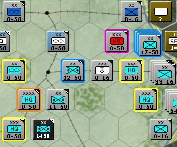
Edit - This is a shot from the '41 campaign, not Typhoon.
RE: Typhoon screenshots
Posted: Tue Dec 29, 2009 10:41 am
by Noakesy
The map looks nice, much better than I expected to be honest, good job. I'm very much looking forward to this, but I have to say I'm not keen on the counters at all (colour of the panzers aside of course [;)]) They look quite retro pc if you know what I mean (might be the font as well as the way the counters are set out). I play the SSG games a lot, and think their counters look the nicest of the 'boardgame' pc games if you know what I mean. Are the ones we see at the moment your final design?
Thanks
RE: Typhoon screenshots
Posted: Wed Dec 30, 2009 12:32 pm
by molchomor
ORIGINAL: Rasputitsa
The colours are good and easy on the eye, some of Gary's other recent games have been dark, with little contrast. I like the lighter WitE Map and the basic unit colours are : German grey, SS black and Russian brown, which are standard. The colour inserts look 'right', nice colour mix and good contrast. We will be looking at this scene for hours and hours, in the near future, and I vote for easy on the eyes. [:)]
r
Agree !
RE: Typhoon screenshots
Posted: Sun Jan 03, 2010 7:36 am
by Noakesy
The 'counters' look very similar to TOAW, are the designers the same out of interest?[:)]
RE: Typhoon screenshots
Posted: Mon Jan 04, 2010 4:24 am
by Joel Billings
No, different designers, although I can't say for sure about the artists involved since I don't know what artist did the TOAW counters (Marc from Matrix did the counter art for WitE). I haven't seen TOAW's counters and I was involved in determining what information appears on the counters and there was no intention or desire to be like any other particular game.
RE: Typhoon screenshots
Posted: Mon Jan 04, 2010 1:27 pm
by colberki
Grey, Black and Brown works for me. I am glad there is a hot key to toggle the colours! Admittedly, I expect to turn on the colours occasionally to check that my units are sticking together!
RE: Typhoon screenshots
Posted: Thu Jan 07, 2010 1:26 am
by Zaratoughda
The color scheme is similar to TOAW but not the same. TOAW has a 3 color scheme and one problem is the 3rd color is used for things like the combat strengths and that sometimes presents readability problems. IMO, the WitE counters look nicer (I really like the multi-color scheme also).
Zartatoughda
RE: Typhoon screenshots
Posted: Fri Jan 08, 2010 7:08 am
by Noakesy
I think the counters look ok, not great but ok. The reason I asked was they looked similar design, and the small triangle in the top right of some of them was something on that system. I also think this game and TOAW lists all participating vehicles etc, but could have that wrong. [:)]