Page 2 of 3
RE: The Age of Shadows is coming to Distant Worlds!
Posted: Sat Apr 06, 2013 1:10 am
by necaradan666
Thank the gods someone mentioned how FUGLY that planet invasion interface is, it was enough to make me rethink purchase when I saw it. Glad you're going to take another look at it. Just remember to check that the starfield area isn't stretching when you enlarge that window, Arcatus didn't seem to mention the difference between the scaled versions.
RE: The Age of Shadows is coming to Distant Worlds!
Posted: Sat Apr 06, 2013 9:18 am
by Arcatus
Erik, thanks,
I understand that there are well considered design choices along the way, and some of the things I like, is definitely not the same tings the you like. (and 30 minutes photoshopping at 3AM, is going to be ugly, but I think my points was made [;)])
Good to hear that the background image is going to be one of those things that is moddable. (But I still find it very disappointing if the game is released with such poor quality (space) images)
While we are on that subject; Are there any modding news? Is there going to be new moddable functions?
RE: The Age of Shadows is coming to Distant Worlds!
Posted: Sat Apr 06, 2013 10:27 am
by Wolfe1759
ORIGINAL: Arcatus
That ground combat interface...

That was my first reaction as well and for pretty much the same reasons subsequently mentioned. From the product page screenshots the Ground Combat interface does look like a work in progress that is still awaiting a graphical "polish" to put it in the same style as the rest of the game.
It would look much better if it was in the same type of window that every other information screen in the game uses.
RE: The Age of Shadows is coming to Distant Worlds!
Posted: Sat Apr 06, 2013 12:27 pm
by Erik Rutins
Hi guys, message heard loud and clear. I'll post up another screenshot after we've given it another pass.
RE: The Age of Shadows is coming to Distant Worlds!
Posted: Sat Apr 06, 2013 12:43 pm
by ASHBERY76

A simple planet grid showing overall control and a panel showing unit actions would look neater.The unit art looks nice but should not make the UI look bad just to show it in some sort of battle motion.
Either way I did not buy DistantWorlds for its eye candy..[:D]
RE: The Age of Shadows is coming to Distant Worlds!
Posted: Sat Apr 06, 2013 12:48 pm
by elmo3
Looks familiar ASHBERY76. Is that MOO3? I wanted so badly for that to be great and it was a dreadful unplayable mess. Distant Worlds just blows that POS away IMHO.
RE: The Age of Shadows is coming to Distant Worlds!
Posted: Sat Apr 06, 2013 2:03 pm
by Spacecadet
ORIGINAL: elmo3
Looks familiar ASHBERY76. Is that MOO3? I wanted so badly for that to be great and it was a dreadful unplayable mess. Distant Worlds just blows that POS away IMHO.
Yeah, that's from MoO3, not that bad a game when it's all patched up (user patches).
RE: The Age of Shadows is coming to Distant Worlds!
Posted: Sat Apr 06, 2013 11:38 pm
by lancer
Hi,
I'd back Arcatus on the planetary invasion mini-screen. I don't want to have to wear sunglasses to play the game.
Looking forward to seeing the next pass. My only suggestion would be to get input from people outside of your existing test group as if they have given the above dogs breakfast of design the thumbs up then their judgement, in this one very specific area, is dubious.
Cheers,
Lancer
RE: The Age of Shadows is coming to Distant Worlds!
Posted: Sun Apr 07, 2013 1:03 am
by Tampa_Gamer
+1 ASHBERY76, I still play MOO3 every now and then (with Strawberry Mod) simply because I think ground combat is one of the few things it got right.
RE: The Age of Shadows is coming to Distant Worlds!
Posted: Sun Apr 07, 2013 5:01 am
by nelsonlee_slith
HOW MUCH?
RE: The Age of Shadows is coming to Distant Worlds!
Posted: Sun Apr 07, 2013 4:40 pm
by hewwo
Phew, glad you guys are looking again at that ground combat interface. In general I think y'all need to hire a profession GUI guy to take a look and give some hints. It's obviously not your strongest point, and however much I love DW, esthetically it looks terrible to the point that it makes me play less (note that I'm not complaining about the graphics of ships, planets etc. here, just the gui).
RE: The Age of Shadows is coming to Distant Worlds!
Posted: Sun Apr 07, 2013 6:12 pm
by tjhkkr

Are the graphical sectors playable, are they just to look pretty?
Am I able to move around and avoid combat if I wish?
RE: The Age of Shadows is coming to Distant Worlds!
Posted: Mon Apr 08, 2013 12:35 pm
by tjhkkr
Hey Erik,
Are the troop Icons a little larger than before? That would help to be able to do see what is happening....
RE: The Age of Shadows is coming to Distant Worlds!
Posted: Mon Apr 08, 2013 4:44 pm
by Demonius
MoO3s ground combat interface works quite well with its minimal graphics and the point it brings across - however, it always felt, and most likely was so, that whatever options you chose didnt really affect the outcome of a random dice roll.
And I must agree that the current DW Ground combat ui looks not that pretty- the planet background is too washed out and the side bar star field... just put a transparent layer there, will you?
RE: The Age of Shadows is coming to Distant Worlds!
Posted: Wed Apr 10, 2013 6:29 pm
by jpwrunyan
You know what is going to bug me the most about the ground combat?
If the landmasses on the planet map for the ground combat don't match the ones on the planet itself viewed from space. Like if it is obvious that they are totally different and unrelated pictures. At this point, maybe it is time to rethink the static graphics for planets and texturize them using 3-d meshes. The final image will still be 2d of course, but programatically generated. And then whether viewed as mercator, equalrectangular, or 3-d hemispherical projection, you will still use the same base texture map and it will still look like the same planet.
Please say you are doing this. Because it is totally doable. We did it on my old project (a weather map that used the same tile images but rendered for polar-stereographic, mercator, and 3-d globe views) and none of us were math-whizzes.
RE: The Age of Shadows is coming to Distant Worlds!
Posted: Wed Apr 10, 2013 6:41 pm
by Erik Rutins
ORIGINAL: jpwrunyan
If the landmasses on the planet map for the ground combat don't match the ones on the planet itself viewed from space. Like if it is obvious that they are totally different and unrelated pictures. At this point, maybe it is time to rethink the static graphics for planets and texturize them using 3-d meshes. The final image will still be 2d of course, but programatically generated. And then whether viewed as mercator, equalrectangular, or 3-d hemispherical projection, you will still use the same base texture map and it will still look like the same planet.
The map for ground combat is representative of the planet type and there is variety, but it is not an exact match for the globe floating in space. Frankly we didn't see the strong need for that as this is a representation rather than a map you move around on. The effects of the planetary terrain are factored into the combat resolution, but this is not a mini-game where the rest of the game stops while you move guys around. In that case, it would make more sense to me. Other than that, it would just be for art variety.
Please say you are doing this. Because it is totally doable. We did it on my old project (a weather map that used the same tile images but rendered for polar-stereographic, mercator, and 3-d globe views) and none of us were math-whizzes.
We're iterating towards a release candidate now, so I don't expect we'll completely redo a substantial portion of the art. We are doing another pass on the ground combat screen though and we'll improve it as much as we can, but we need to work within the realm of diminishing returns and what will keep us on track for a reasonable release timeframe.
Regards,
- Erik
RE: The Age of Shadows is coming to Distant Worlds!
Posted: Wed Apr 10, 2013 6:41 pm
by Erik Rutins
ORIGINAL: tjhkkr
Are the troop Icons a little larger than before? That would help to be able to do see what is happening....
The screen can be viewed in a smaller and larger size. In the larger size, the troop icons are easily visible IMHO.
Regards,
- Erik
RE: The Age of Shadows is coming to Distant Worlds!
Posted: Wed Apr 10, 2013 10:11 pm
by Dracus
ORIGINAL: Arcatus

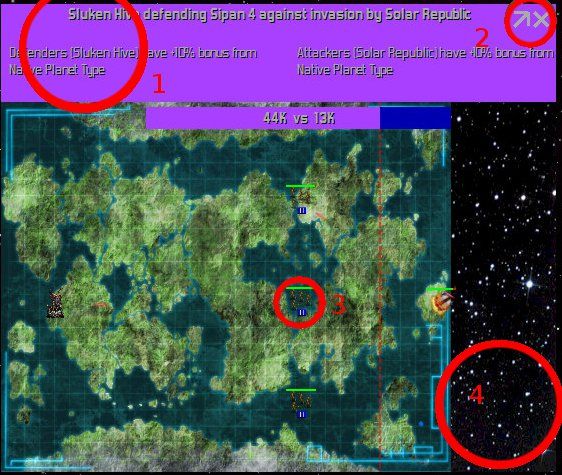
I am sorry but this looks like crap. I could not stand looking at this screen for more then a few seconds. This is like something pulled from an old DOS game. Even the max/close buttons look out dated.
The big color box across the top hurts my eyes to look at. I think the ground map has too much crammed in for a rep view of the ground. It does not fit the look of the rest of the game.
Maybe move the vs total bar to the side and make it vertical rather then horizonal. Having it over the map view just does not look right at all.
Since it is suppose to be a screen as if I was on a ship looking down at the planet with powerful equipment, maybe give the whole thing a border to give that view screen effect.
Just thought of another idea: have the title bar list only the top line stuff. Move the defender and attacker info to the side. Give that area some kind of data screen look and dump the star back ground since that area would now be covered with data. This would make the view more pleasent looking.
If I had the software tools, I would mock one up for you to show what I mean.
RE: The Age of Shadows is coming to Distant Worlds!
Posted: Thu Apr 11, 2013 7:14 pm
by jpwrunyan
Thanks for taking the time to reply, Erik re: planet graphics and ground combat map graphics.
Yeah, I saw from the other thread that this was the case. It's purely a cosmetic issue, I know. It's just one of those things for me. I understand your decision and agree with your priorities--frankly gameplay issues and bugs are what makes or breaks a good game. I doubt most players will have the visual consistency issue register on their radars.
But I hope in the future it's something you guys consider revamping. I am sure Eliot has the skills to do it.
RE: The Age of Shadows is coming to Distant Worlds!
Posted: Thu Apr 11, 2013 7:21 pm
by jpwrunyan
ORIGINAL: Dracus
I am sorry but this looks like crap. I could not stand looking at this screen for more then a few seconds. This is like something pulled from an old DOS game. Even the max/close buttons look out dated.
The big color box across the top hurts my eyes to look at. I think the ground map has too much crammed in for a rep view of the ground. It does not fit the look of the rest of the game.
Maybe move the vs total bar to the side and make it vertical rather then horizonal. Having it over the map view just does not look right at all.
Since it is suppose to be a screen as if I was on a ship looking down at the planet with powerful equipment, maybe give the whole thing a border to give that view screen effect.
Just thought of another idea: have the title bar list only the top line stuff. Move the defender and attacker info to the side. Give that area some kind of data screen look and dump the star back ground since that area would now be covered with data. This would make the view more pleasent looking.
If I had the software tools, I would mock one up for you to show what I mean.
I didn't understand the star thing on the right until viewing the other posts. I honestly don't like the starfield (#4 in the original picture) because I think it is confused with the actual tactical galaxy map.
Also, it feels like it would be more appropriate to be above the ground map and not to its right since, well, space is up...
I think also instead of a starfield, it would be better just to have solid color gradient fill. Like it would be blue at the planet edge and then change to navy blue and then black at the far edge. Representing the atmosphere.
It would also then make the UI conform vertically. So you would have:
<tactical information box>
<orbital display box>
<ground combat map>
No horizontal elements.
Meh.
Bikeshedding.


