Page 3 of 3
RE: Graphics very VGA-ish
Posted: Thu Feb 15, 2007 6:12 am
by goodwoodrw
ORIGINAL: TheHellPatrol
[X(]I don't know what you are talking about, i have the same eye issues as you and with a new Monitor and my current PC glasses nothing has changed since BiN except it's a little prettier IMHO. Sounds like you are playing at too high a resolution or you need a bigger monitor. If you can't read the print then i'd consider getting a different hobby...like i once did before upgrading[;)].
Let me answer your quote without getting into personal Flame war. I have been playing computer games for 15 years, and my number one rule is - if I am going to buy a new game, and I have to buy new hardware to support it don't buy the game, if I broke that rule I would have filed for bankrupcy years ago. I don't normally wear glasses on the computer, this is the only game I wear them for. Ha give gaming just because of one game having graphics that piss me off a little,not likely! I'll just accept I wasted 65 bucks and be more wary of purchasing other games like this, and go back to COTA and others that are more apeasing to the eye.
RE: Graphics very VGA-ish
Posted: Thu Feb 15, 2007 6:46 am
by JSS
ORIGINAL: BASB
...Yes, is the short answer to that, the icons are the major concern, even running the game at 1024 x 768 the icons are too small to read info clearly, so improving the style of the icons wouldn't help, they can't made any bigger or they would flow over into the next hex. the size of the icons seem to be of equal size of those in COTA at 1280 x 1024 resolution. I don't know much about programing, but itappears the whole map is a smaller scale. The hexes are rather small. the text is small, but the problem is the colour of text in relation to the background. I want to play this game, but why should have to go and buy a new 20 inch monitor so I can see the icons.
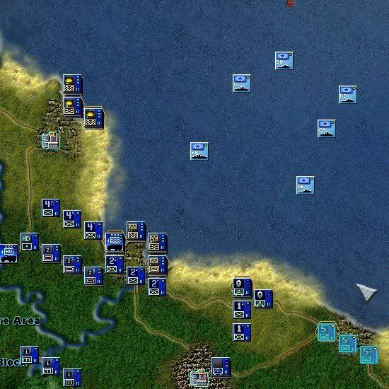
I'm interested in knowing if the shot below looks similar in terms of being hard to see with what you're seeing in the game. This is from a scenario I'm working on and the game is in 1280x1024 mode. Are the unit icons you see below hard to identify by unit symbol? Not sure I'm happy with the unit symbols for the tank battalions and the engineer battalions.
RE: Graphics very VGA-ish
Posted: Thu Feb 15, 2007 8:19 am
by Ursa MAior
I might be wrong, and if I am you can shoot me in this spot, but I recall having the very same look of UI and counters in the original. Even in that time where wargames were scarce in Hungary I disliked so much its appereance that I went back to WiR.
As of Harpoon I have the same issue with it. THe UI and the graphics look the same as in the early 90's. I dont buy that "wanted to look like in a real command centre". I am not an eye candy boy -CotA is the way to go- but after some little tweaks like changing the letters and refining the icons a bit, it could have been a bigger bang. IMHO and for me of course.
If I may give you an advice refresh the GFX of re released games (e.g. Age of sail hint hint) not to a flashy 3D effects wonder, but to a pleasant 21st ecntury look. Thanks for listening.
RE: Graphics very VGA-ish
Posted: Thu Feb 15, 2007 9:07 am
by coralsaw
Kinda jumping late in this thread, but I'd like to second the 'UI mild complaint' issue, if you care to read on for a bit.
I absolutely love the game (although the AI is arguably worse than the Decisive Battles series), and consider it possilly the best in the series so far. I also absolutely love the icons and the gorgeous maps. That's all great.
On the other hand, and this is something I've ranted before about regarding BII/BIN, I really dislike the UI, it simply feels dated. Here's why:
[ol][*]A huge part of the screen is lost forever to panels, there's no full-screen, shortcut-driven interface that allows for full immersion once you get the hang of the keyboard shortcuts. If and when you need to present info, either a modal window or a panel should slide up, but this game is all about the map.
[*]I can't believe there's still no tooltips! Come on guys, this is just old news now. Instead, the right click panel is just too old a concept. Everything has tooltips these days, from Word to the last freeware utility.[*]Where's the context sensitive help? Especially since there's no tutorial available for newbies. If you require your prospect/new customer to pay full attention and read the manual before they jump in, you've just alienated 80% of your potential market. These are no-no mistakes.[*]I've said it many times again, and I'll say it one more time. UIs are expensive to build, expensive to learn, and prone to many many usability errors. Fortunately, the issue is more or less solved for the average Windoze/GUI person. Why reinvent the wheel and roll your own? Why not use the MS GUI? Everyone knows how to use it, the basic key shortcuts, and where everything should fall under in the menus. and God knows I've seen every type of application under the sun using the same GUI successfully. Why does it have to be a custom UI?[/ol]All in all, the interface feels a decade old, and is too. This is such a good wargaming series, why not invest a bit now to create a much better _standard_ interface that will last you for another ten years?
Thanks for listening, I'm always open to counter-arguments to the above.

/coralsaw
RE: Graphics very VGA-ish
Posted: Thu Feb 15, 2007 9:09 am
by DuckofTindalos
ORIGINAL: Ursa MAior
I might be wrong, and if I am you can shoot me in this spot,

Sorry...[:D]
RE: Graphics very VGA-ish
Posted: Thu Feb 15, 2007 9:21 am
by dobeln
I can jump in as a replacement if needed. Just give me a word

RE: Graphics very VGA-ish
Posted: Thu Feb 15, 2007 9:44 am
by Ursa MAior
You got way too much spare time T.
Now get back top the THREAD! [;)]
RE: Graphics very VGA-ish
Posted: Thu Feb 15, 2007 11:18 am
by goodwoodrw
ORIGINAL: JSS
ORIGINAL: BASB
...Yes, is the short answer to that, the icons are the major concern, even running the game at 1024 x 768 the icons are too small to read info clearly, so improving the style of the icons wouldn't help, they can't made any bigger or they would flow over into the next hex. the size of the icons seem to be of equal size of those in COTA at 1280 x 1024 resolution. I don't know much about programing, but itappears the whole map is a smaller scale. The hexes are rather small. the text is small, but the problem is the colour of text in relation to the background. I want to play this game, but why should have to go and buy a new 20 inch monitor so I can see the icons.
I'm interested in knowing if the shot below looks similar in terms of being hard to see with what you're seeing in the game. This is from a scenario I'm working on and the game is in 1280x1024 mode. Are the unit icons you see below hard to identify by unit symbol? Not sure I'm happy with the unit symbols for the tank battalions and the engineer battalions.
Yes and no, is it easy to identify the inf and eng units, but what unit is are they? inf Bn yes, of the 4th bde regt or div. the icon display hasn't the same amount of info as the icons in COTA and if they did, they'd too small to read it. As for the HQ icons and blueish in rh bottom corner ????
RE: Graphics very VGA-ish
Posted: Thu Feb 15, 2007 3:31 pm
by hank
I suppose I'm so used to the KP and BiN icons I'm used to the look. As long as I can tell if its an armored unit or infantry (etc etc), I'm OK with them ... I get my jollies from the side menu graphics, silhouettes, etc. But, I'm inclined to think anything can be improved so maybe a once over to clear up some graphics wouldn't hurt before the patch comes out.
Is it the Divisional insignia's that's causing the problems? They've always been a little rough looking because some are a little too detailed for such a small graphic.
... and I'm fairly sure I fall in the top 5% of the blindest people that play these games. Heck, I have to wear glasses WITH my contact lens. Duh!! what a wreck I've become in my old age.
I haven't ordered my BF yet so take what I say with a grain of salt but looking at the screen prints here and in the AARs, I can't see a significant degradation of the icon graphics from the previous titles. There may be some I can't see from these screen dumps.
hank
RE: Graphics very VGA-ish
Posted: Thu Feb 15, 2007 5:15 pm
by TheHellPatrol
ORIGINAL: BASB
Let me answer your quote without getting into personal Flame war.
[:)]You may have missed my feeble attempt at sillyness as a recent serious illness in my immediate Family has left me little time for rational thinking.
MY POINT: I didn't upgrade my Monitor for Battlefront, i upgraded it a few years back because my eyes were fading even with PC glasses. I recently had to buy a replacement because of wear and bought more or less the same thing...a high-end digital LCD 20" monitor. So, now that i've cleared that up let's get back to the immediate topic: Graphics.
After some objective meditation i find the only difference "for me" is the change of style eg: smaller icons/more info & the lack of gloss the icons seemed to have in BiI and BiN. By "gloss" i mean lacquer like the old chits of boardgaming...the lacquered ones were prettier (and lasted longer).
Sure, they could go 3-D like EU3...but IMHO, and i did consider quitting gaming at one point, the graphics are as good...not better for the icons...as the DB series.
RE: Graphics very VGA-ish
Posted: Thu Feb 15, 2007 5:41 pm
by Motomouse
Once more, I love the battlefront graphics style. The maps are gorgeous. I like the "feel" of the icon insignias and the ui. I remember the BiN screenshots made me wanting & buying that game. But naturally this is a matter of taste. I just wanted to add, that i also dont want all my games created with the same boring windowslike ui. A difference in appearance is really appreciated and I personally like the unique ui of battlefront. Its also true that you can improve every ui and i also think tooltips make for an easier start, although you dont need them anymore after you fought your first operation.
Regards
RE: Graphics very VGA-ish
Posted: Sun Feb 18, 2007 4:57 pm
by PDiFolco
ORIGINAL: Motomouse
Once more, I love the battlefront graphics style. The maps are gorgeous. I like the "feel" of the icon insignias and the ui. I remember the BiN screenshots made me wanting & buying that game. But naturally this is a matter of taste. I just wanted to add, that i also dont want all my games created with the same boring windowslike ui. A difference in appearance is really appreciated and I personally like the unique ui of battlefront. Its also true that you can improve every ui and i also think tooltips make for an easier start, although you dont need them anymore after you fought your first operation.
Regards
Re tooltips : no they aren't bound to be newbie helpers only, but can provide valuables combat, terrain, C3, whatever, up to date information also. Have a look at Birth of America, you'll see what I mean [&o]
I agree that BF is *hugely* lacking in the documentation/tutorial/ease of play aspects, but I still largely enjoy it [;)]