Page 3 of 3
RE: New Screen
Posted: Tue Nov 19, 2013 8:58 am
by welk
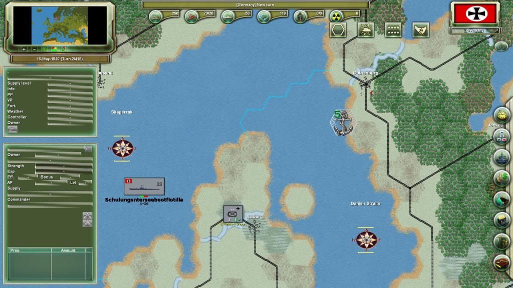
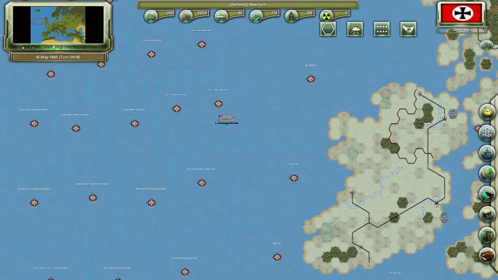
Selection tools graphs will be replaced by new graphs I made or I founded on the web (HQ rattachment symbols, unit selction symbol and attack symbol, etc)
I want that my copy of the game looks like that, at great strategic scale :

RE: New Screen
Posted: Wed Nov 20, 2013 4:52 pm
by SeaMonkey
Excellent presentation, if you could approach the map graphics. Now wouldn't it be great if you could group a number of units behind a front marker that would represent their directional deployments and have them reflect the combined arms in the combat algorithm(or their "users" orders)? I know.....that's for the coder to develop[8D], but that "front marker" could also reflect a number of different orientations(offensive-defensive) of the group through its(front-marker) visual configurations.
Something for future wargame developers to think about.[;)]
RE: New Screen
Posted: Sat Dec 07, 2013 10:17 pm
by geozero
Excited about the game... not impressed with the map and graphics though.
RE: New Screen
Posted: Sun Dec 08, 2013 6:40 am
by Magpius
Geo, I'm pretty sure these screens are little more than musings by one very keen modder. I suspect the vanilla release will look more like SC2, and that more than enough mods will be available shortly afterwards.
RE: New Screen
Posted: Thu Dec 12, 2013 2:53 am
by Hairog
RE: New Screen
Posted: Thu Dec 12, 2013 4:16 pm
by AlvaroSousa
Resources should be distinguished from the rest. As is I find them difficult to scan across the map. Perhaps reduce the size of the resources and put a circle around them with a light color, like brown for resource, black/blue for oil.
For armies you would use a slightly larger symbol with XXXX on it. Might work, might not.
RE: New Screen
Posted: Fri Dec 13, 2013 3:03 am
by Magpius
I'll certainly be putting up some mods once the game is out.
SC1 was one of my all time favourites!