Page 5 of 5
RE: The interface
Posted: Thu Jul 26, 2007 7:58 am
by JudgeDredd
ORIGINAL: marklv
This game is a piece of crap. Incredibly bad interface. Just a small window in the screen, much too small, no scrolling. WTF is this guy thinking?? [:@]
The game itself is also crap. What the hell does one have to do to attack? All these phases are boring and waste time - I want to play the goddamn game, not tinker with it! Commander Europe at War is a much better designed game.
GET THOSE PATCHES IN! THE GAME IS UNPLAYABLE NOW! [:@]
BoIIocks...does this
Commander Europe at War is a much better designed game
mean he's going to be hanging around the Commander Europe at War forum? If so, it almost makes me wish I hadn't bought it.
Seriously, though, people have different opinions and most people are fine with it. But I think some people have communication skill problems.
I mean, seriously, if this guy is working, has no-one smacked him? And if he isn't has his mummy or daddy not smacked him?
RE: The interface
Posted: Thu Jul 26, 2007 8:11 am
by Adam Parker
ORIGINAL: FrankHunter
On the subject of my interfaces, I would agree they aren't that cute. Its what I'm used to so that's how I tend to do it. I'm also not interested in programming interfaces... I can see how that would be frustrating though if a player's interests don't coincide with my own.
Well Frank let me applaud you for the most honest statement I've ever read from a designer.
IMO though, that's where the developer (in this case Matrix) I feel should step in.
However, I can also see the sense in Matrix stepping back from these issues and releasing games as designers intend them, if this is Matrix's intent.
I don't agree with it but it does cement a definite market positioning for Matrix - ie: a company offering "games of all types for all people". IOW a total opposite to the Avalon Hill philosophy of the "AH Way". I'm just a fan of the latter.
RE: The interface
Posted: Thu Jul 26, 2007 9:20 am
by David Heath
Hi Adam
Matrix has always had the policy of being a publisher and not the final say in what gets done. We are here to aid our developers and not force them into choices they don't want. We do give our advice and let our developers know what we will and will not allow but we do that up front. We have all heard to many horror stories of publishers telling developers how its going to be and destroying what could have been a great game.
David
RE: The interface
Posted: Thu Jul 26, 2007 11:08 am
by Adam Parker
ORIGINAL: David Heath
Matrix has always had the policy of being a publisher and not the final say in what gets done....
I really didn't know that David. And you do provide for uniformity in the front screens and installers at least and Marc's art touch is always apparent on the "outside".
ORIGINAL: David Heath
We have all heard to many horror stories of publishers telling developers how its going to be and destroying what could have been a great game.
I'm thinking of one company at least, now gone.
RE: Par for the Course
Posted: Thu Jul 26, 2007 11:32 am
by Noakesy
I think the subject matter and scale looks good, but all I see about this game is complaints about the interface. Are there screen shots or something that show the interface so I can make my own call as to whether it's something I would tolerate or not?
Thanks
RE: Par for the Course
Posted: Thu Jul 26, 2007 11:46 am
by Erik Rutins
Noakesy,
Take a look at the pinned tutorial thread and the gameplay impressions thread.
Regards,
- Erik
RE: Par for the Course
Posted: Thu Jul 26, 2007 12:13 pm
by Noakesy
ORIGINAL: Erik Rutins
Noakesy,
Take a look at the pinned tutorial thread and the gameplay impressions thread.
Regards,
- Erik
Ok, got it thanks - I can see what people mean, but might still give it a thrash. Any screen shots that show me what the resolution problems are?
RE: Par for the Course
Posted: Thu Jul 26, 2007 3:45 pm
by Berkut
ORIGINAL: Noakesy
ORIGINAL: Erik Rutins
Noakesy,
Take a look at the pinned tutorial thread and the gameplay impressions thread.
Regards,
- Erik
Ok, got it thanks - I can see what people mean, but might still give it a thrash. Any screen shots that show me what the resolution problems are?
Well, the extent of the "problem" is going to be based on what your native resolution runs at. If you are running 1024x768, there is no problem at all.
Less than that, and the window will take up less screen, and the window is not resizeable, unfortunately.
And don't let the complaints about the interface dissuade you too much. I still think it is pretty poor, but the thing with interface problems is that
A) You get used to it pretty quickly, and
B) The extent that a poor interface is a problem is a function of the complexity of the interface. A complex, poorly implemented interfact is a nightmare. This is a relatively simply interface though.
The impression I have gotten so far is that the complexity of this game is relatively low, in that the number of differnt types of interaction you do is limited in any given screen. Compared to something like WitP or even TOAW, where you can do LOTS of things, and the poor interface in WitP really makes it a struggle. In GoA, there are a lot of differnt commands, but they are divided into phases, so in any given phase, the set of things you can do is relatively limited. That means that the interface, while clunky, doesn't get in the way as much you might expect.
RE: The interface
Posted: Thu Jul 26, 2007 11:25 pm
by Bossy573
ORIGINAL: Berkut
Just imagine this thing at 1600x1200, seeing ALL of any given front on the screen at the same time...drool.
The game is just that close to being an all time classic. Gameplay is king, but having the ability to enhance the experience in that way would make it all that much better.
RE: The interface
Posted: Thu Jul 26, 2007 11:32 pm
by TheHellPatrol
[8D]Just my 2 cents, the interface does not detract at all from the gameplay or playability. It is very easy to get used to and once this puppy gets polished up it will be a real keeper. A very clever design...i look forward to delving deeper.
RE: Par for the Course
Posted: Thu Jul 26, 2007 11:52 pm
by Bossy573
ORIGINAL: Noakesy
Ok, got it thanks - I can see what people mean, but might still give it a thrash. Any screen shots that show me what the resolution problems are?

[/img]
This is what it looks like at 1600x1200 in Vista. The area of blank screen in the map section makes me sad. That said, gameplay itself is not affected one iota.
RE: Par for the Course
Posted: Fri Jul 27, 2007 12:48 am
by flintlock
Below is another example, though this is at a desktop resolution of 1280x1024. I don't appear to have that border area within the map as Bossy573 does, though I don't see anymore of the map than he does.

Edited to show same image as above.
RE: Par for the Course
Posted: Fri Jul 27, 2007 1:16 am
by 06 Maestro
Yea, Flintlock, my screen looks like yours. The in window dead space on Bossey's looks a little a little odd.
Bossy, did you try to do some game window stretching?
RE: Par for the Course
Posted: Fri Jul 27, 2007 1:21 am
by Bossy573
ORIGINAL: 06 Maestro
Bossy, did you try to do some game window stretching?
Not sure what you mean. I can't move the borders inward or outward, they appear to be fixed.
RE: Par for the Course
Posted: Fri Jul 27, 2007 1:28 am
by 06 Maestro
ORIGINAL: Bossy573
ORIGINAL: 06 Maestro
Bossy, did you try to do some game window stretching?
Not sure what you mean. I can't move the borders inward or outward, they appear to be fixed.
I was just wondering if you tried to do something other than to change your monitors resolution to get a bigger map. The in game window dead space is something I have not seen.
I have been adjusting my resolution (native 1440x900) to get a full screen game window. The result is a somewhat stretched map, but prefer that to the smaller game window.
RE: Par for the Course
Posted: Fri Jul 27, 2007 1:43 am
by Bossy573
Yes. I dropped the res. down to 1024x768 and although the game box fills the screen, the blank area in the game map is still there. The mini-map is distorted too. Weird huh?
I'm tempted to take my 17" CRT home from work this weekend to see if that makes a difference.
The good news is it looks perfect on my laptop.
RE: The interface
Posted: Fri Jul 27, 2007 4:56 am
by AU Tiger_MatrixForum
ORIGINAL: David Heath
Hi Adam
Matrix has always had the policy of being a publisher and not the final say in what gets done. We are here to aid our developers and not force them into choices they don't want. We do give our advice and let our developers know what we will and will not allow but we do that up front. We have all heard to many horror stories of publishers telling developers how its going to be and destroying what could have been a great game.
David
Unnecessary post.
Keep up the good work!
RE: Par for the Course
Posted: Fri Jul 27, 2007 10:38 am
by PJL1973
ORIGINAL: 06 Maestro
Yea, Flintlock, my screen looks like yours. The in window dead space on Bossey's looks a little a little odd.
Bossy, did you try to do some game window stretching?
That's because the 1st screen is from Vista, the second is XP. Vista seems to have an almost retro but updated Win 3.11 look at times (especially with the frosted blue border).
Edit, never mind I mistook the comment for something else. But my comment about the window edge still stands.
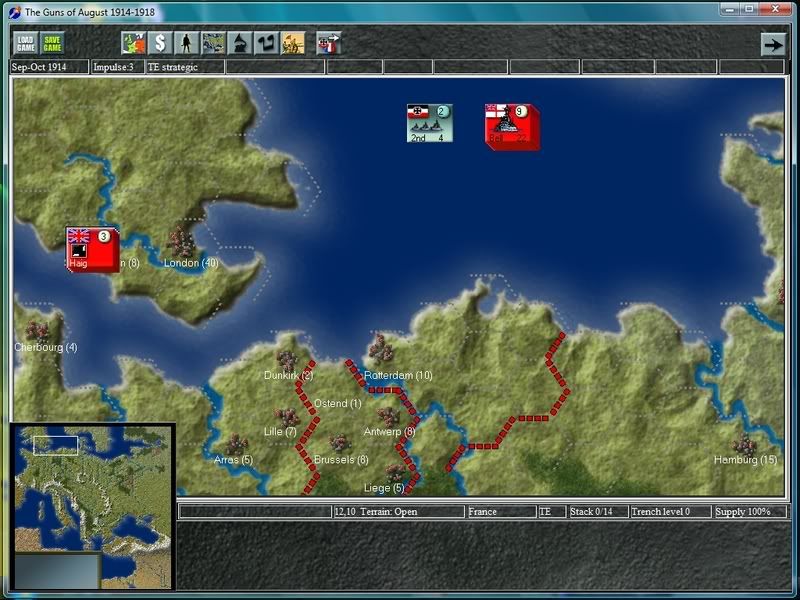
BTW, this is how it should look under Vista (1024x768 resolution).
RE: Par for the Course
Posted: Sat Jul 28, 2007 2:33 am
by Bossy573
ORIGINAL: Bossy573
[/img]
This is what it looks like at 1600x1200 in Vista. The area of blank screen in the map section makes me sad. That said, gameplay itself is not affected one iota.
Just want to set the record straight on this. If you set the DPI to normal (96), there is no issue with empty space in the game window. I apologize for bringing it up as a "problem." It is not.