

I downloaded the patch, should I install it or are problems still evident?
Thanks
a complete graphics and interface overhaul
Moderators: JAMiAM, ralphtricky
RE: a complete graphics and interface overhaul
@Demjansk - There have been no reported problems with 3.4.1.9.
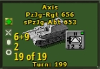
Compared to what we have [seen in the screen shot] I agree, nice idea. The only Action we have available from this OOB is to click on a unit so that the box will close and the map then centers on that unit. A 'new' tree type display could do the same thing. It might be a challenge for the graphics people, they need to allow for whatever the parameters are expanded to. Currently we have what - 2,000 units and 400 formations ? That's a big tree ! And since every scenario is different, the scenario designers would have to have the ability to build the tree. The player would want the ability to modify the tree. Hmm ... if the player could modify it, then the designer wouldn't really have to do it if they didn't want to, just let the player do it if they want.
Anyway, it sounds like a great idea, and would be much better than what we currently have.
EDIT: Ah, I didn't check my mouse over news at the bottom, we can also go to the Unit Report from here. I never use the OOB Dialogue so I didn't know that.

It is just the principle of the tree that I found interesting to display the OOB and for easy navigation between units.
Compared to what we have [seen in the screen shot] I agree, nice idea. The only Action we have available from this OOB is to click on a unit so that the box will close and the map then centers on that unit. A 'new' tree type display could do the same thing. It might be a challenge for the graphics people, they need to allow for whatever the parameters are expanded to. Currently we have what - 2,000 units and 400 formations ? That's a big tree ! And since every scenario is different, the scenario designers would have to have the ability to build the tree. The player would want the ability to modify the tree. Hmm ... if the player could modify it, then the designer wouldn't really have to do it if they didn't want to, just let the player do it if they want.
Anyway, it sounds like a great idea, and would be much better than what we currently have.
EDIT: Ah, I didn't check my mouse over news at the bottom, we can also go to the Unit Report from here. I never use the OOB Dialogue so I didn't know that.
- Attachments
-
- jpeg22.jpg (81.98 KiB) Viewed 783 times
RE: a complete graphics and interface overhaul
Another example of an Expandable OOB Display, not so much a tree as linear:

- Attachments
-
- jpeg23.jpg (89.73 KiB) Viewed 783 times

RE: a complete graphics and interface overhaul
I like the way Decisive Campaigns does it. Extremely flexible plus if you click a category to the left it will give you every unit of that type. You can click on units and it will jump to the unit's location.

- Attachments
-
- ScreenHunt..1317.04.jpg (102.62 KiB) Viewed 783 times
ne nothi tere te deorsum (don't let the bastards grind you down)
If duct tape doesn't fix it then you are not using enough duct tape.
Two things are infinite: the universe and human stupidity and I’m not sure about the universe-Einstein.
If duct tape doesn't fix it then you are not using enough duct tape.
Two things are infinite: the universe and human stupidity and I’m not sure about the universe-Einstein.
RE: a complete graphics and interface overhaul
ORIGINAL: Freyr Oakenshield
ORIGINAL: Lobster
ORIGINAL: sPzAbt653
Yeah, but different resolutions use different death star space, so that might not be possible.
Maybe the Unit Display at the upper right could be slightly expanded ?
You've got 2560 x 1440 and you want MORE ?? Seriously though, what if there were more zoom choices [other than the three currently available] ? I mean, I think you can get to a certain point where you get a lot of map, but its not really playable because the units are too small.
The 'death star' that you guys mention is actually redundant. The battle planner shows how much of a turn a battle should take, although not entirely accurate due to randomness. And at the end of each round of combat you are told how much of the turn is left. Why not eliminate that redundant visual, the star, and stretch the buttons down to occupy that space giving more room for other things that are important.
The "death star" is not redundant. It's very informative and enables you to quickly see how much turn will be burnt. As for the battle planner, come on..., who uses the battle planner but absolute beginners...?
After playing the game since TOAW I, me.
ne nothi tere te deorsum (don't let the bastards grind you down)
If duct tape doesn't fix it then you are not using enough duct tape.
Two things are infinite: the universe and human stupidity and I’m not sure about the universe-Einstein.
If duct tape doesn't fix it then you are not using enough duct tape.
Two things are infinite: the universe and human stupidity and I’m not sure about the universe-Einstein.
RE: a complete graphics and interface overhaul
WITE's OOB screen is pretty nice too

- Attachments
-
- bvbb.jpg (155.82 KiB) Viewed 783 times
RE: a complete graphics and interface overhaul
I guess. But the colors promote depression. [:D]
ne nothi tere te deorsum (don't let the bastards grind you down)
If duct tape doesn't fix it then you are not using enough duct tape.
Two things are infinite: the universe and human stupidity and I’m not sure about the universe-Einstein.
If duct tape doesn't fix it then you are not using enough duct tape.
Two things are infinite: the universe and human stupidity and I’m not sure about the universe-Einstein.
RE: a complete graphics and interface overhaul
[:)] Had to lower jpg quality to keep the file under 200kb.ORIGINAL: Lobster
I guess. But the colors promote depression. [:D]
-
Freyr Oakenshield
- Posts: 561
- Joined: Fri Apr 25, 2014 12:19 pm
- Location: Planet Earth
RE: a complete graphics and interface overhaul
ORIGINAL: sPzAbt653
Another example of an Expandable OOB Display, not so much a tree as linear:
Is this V for Victory?
RE: a complete graphics and interface overhaul
Well, one thing that jumps on front looking to other games' oob screens, is that the TOAW one is ridiculously small, needlessly so (you can't play with the oob screen open), making it bigger allow to vastly improvement of it.
RE: a complete graphics and interface overhaul
Is this V for Victory?
Yeah, V4V. [My favorite Supply and Attachment system].
-
Freyr Oakenshield
- Posts: 561
- Joined: Fri Apr 25, 2014 12:19 pm
- Location: Planet Earth
RE: a complete graphics and interface overhaul
ORIGINAL: sPzAbt653
Is this V for Victory?
Yeah, V4V. [My favorite Supply and Attachment system].
Those were the days![8D]
As for "a complete graphics and interface overhaul," this is from SSG's Kharkov:

- Attachments
-
- oob.jpg (191.27 KiB) Viewed 783 times
RE: a complete graphics and interface overhaul
ORIGINAL: Meyer1
Well, one thing that jumps on front looking to other games' oob screens, is that the TOAW one is ridiculously small, needlessly so (you can't play with the oob screen open), making it bigger allow to vastly improvement of it.
Right. So much could be done to make it hugely better.
ne nothi tere te deorsum (don't let the bastards grind you down)
If duct tape doesn't fix it then you are not using enough duct tape.
Two things are infinite: the universe and human stupidity and I’m not sure about the universe-Einstein.
If duct tape doesn't fix it then you are not using enough duct tape.
Two things are infinite: the universe and human stupidity and I’m not sure about the universe-Einstein.
-
Freyr Oakenshield
- Posts: 561
- Joined: Fri Apr 25, 2014 12:19 pm
- Location: Planet Earth
RE: a complete graphics and interface overhaul
This is from Tiller's Pz Campaigns. It's simple graphically but a lot better than what we have now in TOAW.
It's simple and clear. I wouldn't mind having something like this in TOAW.

It's simple and clear. I wouldn't mind having something like this in TOAW.
- Attachments
-
- oob23244.jpg (182.64 KiB) Viewed 783 times
RE: a complete graphics and interface overhaul
The units are clickable. But you can't go to the location of any units by clicking on them. It only highlights the units. You have to scroll the map to find them. Something I've always wondered about when playing his games.
ne nothi tere te deorsum (don't let the bastards grind you down)
If duct tape doesn't fix it then you are not using enough duct tape.
Two things are infinite: the universe and human stupidity and I’m not sure about the universe-Einstein.
If duct tape doesn't fix it then you are not using enough duct tape.
Two things are infinite: the universe and human stupidity and I’m not sure about the universe-Einstein.
RE: a complete graphics and interface overhaul
This is from Tiller's Pz Campaigns.
Ants on a light bulb, that is worse than using 1024 x 768, lol.
-
Freyr Oakenshield
- Posts: 561
- Joined: Fri Apr 25, 2014 12:19 pm
- Location: Planet Earth
RE: a complete graphics and interface overhaul
You can always give it some colour, change the size of the font, etc...
edit:
I was referring rather to the general structure of the OOB - the tree.
edit:
I was referring rather to the general structure of the OOB - the tree.
RE: a complete graphics and interface overhaul
ORIGINAL: Freyr Oakenshield
You can always give it some colour, change the size of the font, etc...
edit:
I was referring rather to the general structure of the OOB - the tree.
Hey, I wish that we would have something like that on TOAW. Makes playing monster scenarios so much easier.
-
Freyr Oakenshield
- Posts: 561
- Joined: Fri Apr 25, 2014 12:19 pm
- Location: Planet Earth
RE: a complete graphics and interface overhaul
ORIGINAL: Meyer1
ORIGINAL: Freyr Oakenshield
You can always give it some colour, change the size of the font, etc...
edit:
I was referring rather to the general structure of the OOB - the tree.
Hey, I wish that we would have something like that on TOAW. Makes playing monster scenarios so much easier.
Of all the OOBs presented here, I think I like the Decisive Campaigns OOB best. But yes, Tiller's would probably be a lot better for huge scenarios with thousands of units.
RE: a complete graphics and interface overhaul
You can always give it some colour, change the size of the font, etc...
YAY !! Options !! [I was joking of course, that's why I put the 'lol' at the end, didn't mean to pick on it].
I think I like the Decisive Campaigns OOB best.
I can't decide if like either better than another, but as long as Matrix changes it to something more useful than what is there now, I would be happy. Probably even more than happy.