Graphics Help

Post new mods and scenarios here.

Moderator: Shannon V. OKeets

User avatar
WarHunter
Posts: 1174
Joined: Sun Mar 21, 2004 6:27 pm

RE: Graphics Help

Post by WarHunter »

ORIGINAL: paulderynck
I had hoped the twinges of orange would go with the NATO color.
Edit: now if they were swapped again, along with the orange this time (because I think it looks better with that paler shade of green).
I think this is what's hitting me subconsciously (yes I know it wasn't the flag until 1947)...
Of course on that note, you need to also swap Canada and Australia.

paulderynck, Don't think we want to change Canada and Australia. they are pretty close to the board game colors considering our restrictions. Centuur gave an ok for colorblind players.

Using the flag colors of India is a good idea. I have a few color combos you can look at. See which one catches your fancy.


Image
Attachments
indiago.jpg
indiago.jpg (43.6 KiB) Viewed 305 times
Image
“We never felt like we were losing until we were actually dead.”
Marcus Luttrell
User avatar
AxelNL
Posts: 2389
Joined: Sat Sep 24, 2011 12:43 pm
Location: The Netherlands

RE: Graphics Help

Post by AxelNL »

Bottom right would get my vote. The orange was the interior RSA colour, looks nice as well but could be confusing. The top middle looks good, though.
User avatar
paulderynck
Posts: 8477
Joined: Sat Mar 24, 2007 5:27 pm
Location: Canada

RE: Graphics Help

Post by paulderynck »

I like the bottom left the best except the "IND" looks blurry. If the "IND" can't be black then bottom middle is best IMO. For Canada and Australia I meant only to interchange the blue and red.
Paul
User avatar
Ichirou989
Posts: 54
Joined: Tue Jun 07, 2005 4:36 pm

RE: Graphics Help

Post by Ichirou989 »

I prefer the top middle as well as the abbreviation has more contrast. Second choice would be bottom right.
A real leader faces the music, even when he doesn't like the tune.

Image
User avatar
YellowNo5
Posts: 24
Joined: Fri Feb 28, 2014 11:28 am

RE: Graphics Help

Post by YellowNo5 »

I like top left. This one might take a while [;)]
User avatar
Orm
Posts: 30729
Joined: Sat May 03, 2008 7:53 pm
Location: Sweden

RE: Graphics Help

Post by Orm »

ORIGINAL: YellowNo5

I like top left. This one might take a while [;)]
I prefer the top left as well.
Have a bit more patience with newbies. Of course some of them act dumb -- they're often students, for heaven's sake. - Terry Pratchett

A government is a body of people; usually, notably, ungoverned. - Quote from Firefly
User avatar
WarHunter
Posts: 1174
Joined: Sun Mar 21, 2004 6:27 pm

RE: Graphics Help

Post by WarHunter »

ORIGINAL: paulderynck

I like the bottom left the best except the "IND" looks blurry. If the "IND" can't be black then bottom middle is best IMO. For Canada and Australia I meant only to interchange the blue and red.

The big restriction here is whatever color is picked to outline the NATO symbol is also the color for the abbreviation.

Getting the impression from the comments a Green background is acceptable by everyone. The only question that remains is the outline.

I'll create some black and orange and yellow for viewing later. See if we can narrow it down again. [:)]

Canada and Australia is doable, the colors are the way they are because the counter sheets use them. But i see your pov based on flag color like India.
back later
Image
“We never felt like we were losing until we were actually dead.”
Marcus Luttrell
User avatar
paulderynck
Posts: 8477
Joined: Sat Mar 24, 2007 5:27 pm
Location: Canada

RE: Graphics Help

Post by paulderynck »

Looking at my KiF units, Canada has red lines and a yellow background for the NATO symbol. Australia has red lines and a white background.

So I'm suggesting red background and blue background respectively.
Paul
User avatar
Centuur
Posts: 9066
Joined: Fri Jun 03, 2011 12:03 pm
Location: Hoorn (NED).

RE: Graphics Help

Post by Centuur »

ORIGINAL: WarHunter

ORIGINAL: paulderynck
I had hoped the twinges of orange would go with the NATO color.
Edit: now if they were swapped again, along with the orange this time (because I think it looks better with that paler shade of green).
I think this is what's hitting me subconsciously (yes I know it wasn't the flag until 1947)...
Of course on that note, you need to also swap Canada and Australia.

paulderynck, Don't think we want to change Canada and Australia. they are pretty close to the board game colors considering our restrictions. Centuur gave an ok for colorblind players.

Using the flag colors of India is a good idea. I have a few color combos you can look at. See which one catches your fancy.


Image
Only the two on the left side of the six are good enough for me. But beware, other colorblinds may say otherwise, since the use of these colors is dangerous, since they might cause colorblind not to see the type of unit (INF, GAR, MOT, etc. etc. Change the unit type within the counters to black, and things are a lot better. (the cross for the INF in black should do the trick).
Peter
User avatar
warspite1
Posts: 42124
Joined: Sat Feb 02, 2008 1:06 pm
Location: England

RE: Graphics Help

Post by warspite1 »

ORIGINAL: WarHunter

ORIGINAL: paulderynck
I had hoped the twinges of orange would go with the NATO color.
Edit: now if they were swapped again, along with the orange this time (because I think it looks better with that paler shade of green).
I think this is what's hitting me subconsciously (yes I know it wasn't the flag until 1947)...
Of course on that note, you need to also swap Canada and Australia.

paulderynck, Don't think we want to change Canada and Australia. they are pretty close to the board game colors considering our restrictions. Centuur gave an ok for colorblind players.

Using the flag colors of India is a good idea. I have a few color combos you can look at. See which one catches your fancy.
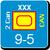


Image
warspite1

Top left by miles imo.
Now Maitland, now's your time!

Duke of Wellington to 1st Guards Brigade - Waterloo 18 June 1815
Shannon V. OKeets
Posts: 22165
Joined: Wed May 18, 2005 11:51 pm
Location: Honolulu, Hawaii
Contact:

RE: Graphics Help

Post by Shannon V. OKeets »

ORIGINAL: WarHunter

ORIGINAL: paulderynck
I had hoped the twinges of orange would go with the NATO color.
Edit: now if they were swapped again, along with the orange this time (because I think it looks better with that paler shade of green).
I think this is what's hitting me subconsciously (yes I know it wasn't the flag until 1947)...
Of course on that note, you need to also swap Canada and Australia.

paulderynck, Don't think we want to change Canada and Australia. they are pretty close to the board game colors considering our restrictions. Centuur gave an ok for colorblind players.

Using the flag colors of India is a good idea. I have a few color combos you can look at. See which one catches your fancy.


Image
I have to chuckle at the voting. Almost every one of the six got at least one vote.[:D]

Legibility lies in the contrast between adjacent colors. The light orange and the khaki don't have very much contrast to my eye (the good one). Notice that the black has a high contrast with the khaki, so the numbers and letters in black show up clearly. So, I recommend choosing a dark color for the NATO outline and a light color for the NATO interior.

I prefer, in order: top center, top left (a very close 2nd), top right, bottom right. The bottom left and center do not work for me at all, with the IND virtually disappearing against the khaki.
Steve

Perfection is an elusive goal.
markb50k
Posts: 1224
Joined: Thu Jul 01, 2004 1:26 pm
Location: Spring, TX

RE: Graphics Help

Post by markb50k »

can we just go with something and finish this off, and then get a new version of the pack? pleaaaase!!!

I want to feature it in my AAR!
User avatar
paulderynck
Posts: 8477
Joined: Sat Mar 24, 2007 5:27 pm
Location: Canada

RE: Graphics Help

Post by paulderynck »

OK everyone gets 4 votes and Warhunter can do a weighted choice selection. [;)]

Looking again, I now hereby renounce my first two choices and go with top left first, then top center, top right, bottom right.
Paul
User avatar
Centuur
Posts: 9066
Joined: Fri Jun 03, 2011 12:03 pm
Location: Hoorn (NED).

RE: Graphics Help

Post by Centuur »

I go for top left first.
Peter
User avatar
warspite1
Posts: 42124
Joined: Sat Feb 02, 2008 1:06 pm
Location: England

RE: Graphics Help

Post by warspite1 »

As I said, top left - but I would not use my other three votes as I do not like the others enough, even as 2nd, 3rd and 4th choices.
Now Maitland, now's your time!

Duke of Wellington to 1st Guards Brigade - Waterloo 18 June 1815
User avatar
AxelNL
Posts: 2389
Joined: Sat Sep 24, 2011 12:43 pm
Location: The Netherlands

RE: Graphics Help

Post by AxelNL »

ok - top centre,

I suggest Warhunter comes up with something in the middel of top left and top centre.
User avatar
WarHunter
Posts: 1174
Joined: Sun Mar 21, 2004 6:27 pm

RE: Graphics Help

Post by WarHunter »

ORIGINAL: AxelNL
I suggest Warhunter comes up with something in the middel of top left and top centre.

With all the talk above, Green for the abbreviation it is. Its a darker green to show up better. Added 1 with black outline for comparison. And the previous screenshot also. the orange is in mid range not to light or dark. the Pink one is in case it is all fubar. [:D]
deleted Pink choice added a better one.

It has been fun working with you all

Image
Attachments
gbindiaj.jpg
gbindiaj.jpg (64.38 KiB) Viewed 305 times
Image
“We never felt like we were losing until we were actually dead.”
Marcus Luttrell
User avatar
warspite1
Posts: 42124
Joined: Sat Feb 02, 2008 1:06 pm
Location: England

RE: Graphics Help

Post by warspite1 »

ORIGINAL: WarHunter
ORIGINAL: AxelNL
I suggest Warhunter comes up with something in the middel of top left and top centre.

With all the talk above, Green for the abbreviation it is. Its a darker green to show up better. Added 1 with black outline for comparison. And the previous screenshot also. the orange is in mid range not to light or dark. the Pink one is in case it is all fubar. [:D]
deleted Pink choice added a better one.

It has been fun working with you all

Image
warspite1

I'm confused - what have you gone with? The previous top left was easily the winner.
Now Maitland, now's your time!

Duke of Wellington to 1st Guards Brigade - Waterloo 18 June 1815
User avatar
AxelNL
Posts: 2389
Joined: Sat Sep 24, 2011 12:43 pm
Location: The Netherlands

RE: Graphics Help

Post by AxelNL »

I see. The 6 on the right are the previous ones.
So we have the 3 on the left which are the new versions, with an orange colour which is the middle of the previous top left and centre. I like that choice for orange.

The three new ones on the left are outlined in black, dark green and the light green of the old top left. For us to comment on.

I think the black is too dull for a CW nation. But that luckely that was only for comparison to the new dark green next to it. That is indeed much nicer for the eyes. The lower one has the same light green as the old top left.

My opinion is that the light green is a bit too light, and the dark green could be a tad lighter.

Conclusion: I think the orange colour is now OK. The green could have a bit more work. Although I would not mind the dark green chosen already.
User avatar
warspite1
Posts: 42124
Joined: Sat Feb 02, 2008 1:06 pm
Location: England

RE: Graphics Help

Post by warspite1 »

ORIGINAL: AxelNL

I see. The 6 on the right are the previous ones.
So we have the 3 on the left which are the new versions, with an orange colour which is the middle of the previous top left and centre. I like that choice for orange.

The three new ones on the left are outlined in black, dark green and the light green of the old top left. For us to comment on.

I think the black is too dull for a CW nation. But that luckely that was only for comparison to the new dark green next to it. That is indeed much nicer for the eyes. The lower one has the same light green as the old top left.

My opinion is that the light green is a bit too light, and the dark green could be a tad lighter.

Conclusion: I think the orange colour is now OK. The green could have a bit more work. Although I would not mind the dark green chosen already.
warspite1

If the choice is between the three on the left - then its the bottom one pour moi.
Now Maitland, now's your time!

Duke of Wellington to 1st Guards Brigade - Waterloo 18 June 1815
Post Reply

Return to “Mods and Scenarios”