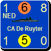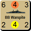
ORIGINAL: AxelNL
I see. The 6 on the right are the previous ones.
So we have the 3 on the left which are the new versions, with an orange colour which is the middle of the previous top left and centre. I like that choice for orange.
The three new ones on the left are outlined in black, dark green and the light green of the old top left. For us to comment on.
I think the black is too dull for a CW nation. But that luckely that was only for comparison to the new dark green next to it. That is indeed much nicer for the eyes. The lower one has the same light green as the old top left.
My opinion is that the light green is a bit too light, and the dark green could be a tad lighter.
Conclusion: I think the orange colour is now OK. The green could have a bit more work. Although I would not mind the dark green chosen already.
All correct.
Left bottom has shades of green and orange in between the top left of the original six. Added the Black outlined and darker green for comparison.
I'll get a screen of the counter mix up so everyone can see how it looks completed. That will be the best way to compare everything together. I'll add the bottom left as the Indian colors for now.