Hello Hubert
I believe there are 'votes' for both one additional zoom in level and one additional zoom out level (as per n0kn0k and skb8721)
regards
Ben Wilkins
Yes please, please. We need to be able to zoom in a bit more to see the beautiful graphics better. It will really enhance the game dramatically when we're not so far away from the front-line technically speaking.
Moving artillery units into enemy controlled hexes is not very customer friendly, nor will it help to feel new players at home.
Suggestion: artillery units move on right mouse clicks. Wouldn't that be possible, or is the right mouse click already used for a different purpose if you have activated an artillery unit?
In case that you don't want to change the artillery unit movement, please remove the combat odd information for them once the player uses the CTRL key. Everything else is just to confusing.
"You will be dead, so long as you refuse to die" (George MacDonald)
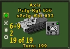
The NEW UNIT button at the top of the screen should only be lit if the player has a unit to place. Looks a bit like a bug if it is lit while no unit remains which could be placed.
edit:
please show the PRODUCTION menu instead once there are no more units to place. This would help quite a bit, and it i´s indeed conected with "new units". This way the play can learn faster than before which units will when arrive.
"You will be dead, so long as you refuse to die" (George MacDonald)
Change graphics/fonts: The text/graphics are the same from the original Strategic Command. The whole appearance is very dated. The little "up/down arrows" in the pop ups are too small and difficult to manipulate. The first thing you think when you see this game is "this looks old".
Mechanism to move units on strategic map: I wish I could see convoy routes and move units,particularly naval, on the strategic map. This would be an actual use of this map, and be a more efficient way to deal with far flung naval units.
Commands to reinforce multiple units at once (one command reinforces everyone).
Hard to see fortified hexes in any map setting. For that matter, much of the map is hard to see when there is snow.
I wish I could move units in groups. Click on "x" many units and tell them to move east/west/north/south until something or someone stops them.
Short of that, allow way points to direct unit movement and let them move themselves. When moving units, say from East to West Front as Germany, every turn clicking each unit is tedious.
Launching the tabs at the top of the screen was frustrating and unintuitive. Constantly clicking to get them to appear or disappear.
Change music (or allow user to add their own easily).
Change graphics/fonts: The text/graphics are the same from the original Strategic Command. The whole appearance is very dated. The little "up/down arrows" in the pop ups are too small and difficult to manipulate. The first thing you think when you see this game is "this looks old".
I greatly disagree with this statement. The entire look of the new game is incredible and a fantastic change. As was mentioned in the main threads the UI is not done and a lot is still slated to be changed. Also mentioned previously snow will be toned down so it's easier to see through.
I find it's very easy to see fortified hexes myself and this is on an high res monitor which makes things tiny.
As I've stated, I've played the game from the original versions, and the tables/text/strategic maps haven't changed much at all. The historical event pop-ups can be defended as trying to maintain a "period" feel but the tables look archaic and trying to adjust tiny arrow buttons shouldn't be necessary.
No, the fortifications are not easy to see. I've got pretty good vision (still) and I have a hard time picking out all the detail on the map, particularly with units present but even without them on the map. Make the fortification lines thicker, different colors, give the user an option to highlight them-something. In this day and age of computers this shouldn't be an issue.
As I've stated, I've played the game from the original versions, and the tables/text/strategic maps haven't changed much at all. The historical event pop-ups can be defended as trying to maintain a "period" feel but the tables look archaic and trying to adjust tiny arrow buttons shouldn't be necessary.
Hi
Thanks for the feedback and the good news is that all of the tables/text/strategic map you're referring to are exactly the same as in SC2 as the UI isn't finished yet. Hopefully you'll like the designs that will replace them when the UI is done. [:)]
This may have been brought up before - but the up/down arrows on many of the windows (for example when upgrading a land unit - +1 mobility...) is not very clear and needs too precise of control to increment/decrement the value. A simple icon with '+' or '-' next to the text would make it much more clear and be easier to use for this old man with poor fine motor control.
It might be nice if Subs had the Blue raiding dot like the surface raiders instead of being blank, for consistency. Even after playing this for a couple months now, I still get confused who is doing what.
The Alps between France and Italy should have some high mountains, preferably impassible hexes in all but 2 spots. France held off a sizable Italian force with 6 divisions (if I remember)
Concern for the # of ships and the # of ports in the game. Some ports were much larger than represented in the game like Alexandria, Kiel, and Cherbourg. Shouldn't there be 2 ports in these spots?
When creating a new unit, if I touch the Upgrades buttons after naming the unit, the Unit Name is erased. I think maybe it would be ok if the name wasn't erased by hitting the Upgrade buttons.