Graphics Help
Moderator: Shannon V. OKeets
RE: Graphics Help
Warhunter: Looks good!
Warspite1: The dominion tag is the only thing that seems to be excluded from the modding.
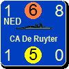
One more thing: the symbol interior colour for non-elite british units is still dark blue, that should be a olive/brownish hue (see MECH/MOT first row of the AiF coutners).
Warspite1: The dominion tag is the only thing that seems to be excluded from the modding.
One more thing: the symbol interior colour for non-elite british units is still dark blue, that should be a olive/brownish hue (see MECH/MOT first row of the AiF coutners).
"If we come to a minefield, our infantry attacks exactly as it were not there." ~ Georgy Zhukov
RE: Graphics Help
ORIGINAL: Dabrion
Warhunter: Looks good!
Warspite1: The dominion tag is the only thing that seems to be excluded from the modding.
One more thing: the symbol interior colour for non-elite british units is still dark blue, that should be a olive/brownish hue (see MECH/MOT first row of the AiF coutners).
Now I see what the second die in your avatar is telling! Neutral! Didn't know they made AD&D alignment dice for the indecisive. Cool.
So fate decided it is neutral-evil for you, and this is the way you are telling/warning us? Given your posts on rules discussions I would have said you would be more inclined to the side of law. And in this thread the evil is not really visible, more neutral.
Still playing AD&D? For me it was 24 years ago. I am waiting for my kids to get a bit older to try a out a session with them, although being a GM will be the first time, so I don't know if that will be a success..
RE: Graphics Help
We settled for Paizo's Pathfinder some years ago and play an old Greyhawk campaign (Age of Worms), but it's more like one session in two month..
"If we come to a minefield, our infantry attacks exactly as it were not there." ~ Georgy Zhukov
- Ichirou989
- Posts: 54
- Joined: Tue Jun 07, 2005 4:36 pm
RE: Graphics Help
ORIGINAL: warspite1
Looks good - why not just use white for the RSA lettering on the right-hand side?
First, I agree as well that this khaki looks very good. [8D]
As for the lettering, that is a problem I brought up before; nowhere in any of the CSV files do I see any way of changing the different shades of the lettering. Both South Africa and Canada to a lesser degree, don't show up too hot. At this point I'm beginning to think that the side lettering color is hard coded somehow, which would be a pity.
On the other hand, the original counters didn't have that lettering, and it is a bit redundant since the NATO symbol backgrounds was the chief way of denoting nationality within a major power. Anyway, if anyone manages to come across how to change the color of those nation abbreviations, please let us know. Now I'm going to see about changing the CW units to that new shade and see how it looks.
A real leader faces the music, even when he doesn't like the tune.


RE: Graphics Help
Before i login to my pillow. Here is some stuff for you all to talk about.
Found the spot to change the color of RSA. Should be the same for AUS, CAN and IND. Used $00091f33 for the change in color for RSA. It was just a test color. As i was checking all color positions.
What colors to use? White is really not a good color for me. You all can hash it out. be back in a few hours.
Screenshot tells all.
Thanks for the help guys!

- Attachments
-
- cwlandC.jpg (404.21 KiB) Viewed 293 times

“We never felt like we were losing until we were actually dead.”
Marcus Luttrell
RE: Graphics Help
Looks good to me. These counters are so colourfull that I bit of plain dark text on the right gives rest to the eyes. Loosing the orange colour in the nato symbol is perhaps a bit of a shame. Does that happen automatically? There are others where it seems not linked.
Edit: I misunderstood. By changing the interior colour of the NATO symbol you managed to change the colour of the three letters as well. But Indians have green as interior colour and red for the letters??? That is probably hard-coded?
This relationship does not seem to be existing with the non CW-nation Territorials, however.
Perhaps experimenting with the Indians by changing the red border into black could give more insight? (the red border does not look good anyhow. I think my glasses refract the red different than the green when looking a bit sideways - causing overlap/aliasing).
If we can't re-engineer this I would hesitate. A colored three letter code means it is one of the CW nations. Black means from a colony. If we give RSA a black interior it is not corresponding to this rule anymore. Perhaps a darker orange could help in this respect, but than we come probably too close to the red of the border. As any CW nation other than the UK have all red borders we should perhaps respect that (so forget about changing the Indians).
Hmm - I think I would leave the orange at this moment. For me the colour is a automatic link to RSA as Afrikaners speak a Dutch offbreed and orange is our national colour (who watched the Sotchi speedskating?). But this is probably different for others. Perhaps purple?
RE: Graphics Help
Deleted - see edit above
Edit: do the normal inf CW divs have the right interior colour? Can't tell from Dabrion's photo.
Edit: do the normal inf CW divs have the right interior colour? Can't tell from Dabrion's photo.
- Ichirou989
- Posts: 54
- Joined: Tue Jun 07, 2005 4:36 pm
RE: Graphics Help
A new discovery, interesting. I had tried changing the background color on the NZL units from blue to aqua, but it had no effect on the letters to the right, they stayed white. So maybe for some countries it is hard coded? I feel like we're missing something here. In any case, for me I'll be leaving the colors as they are for the NATO symbol backgrounds as I am quite used to each color background and who it represents at a glance.
Also, here's an example of the planes in the new color:

Also, here's an example of the planes in the new color:

- Attachments
-
- Untitled9.jpg (56.67 KiB) Viewed 293 times
A real leader faces the music, even when he doesn't like the tune.


RE: Graphics Help
This post made me smile.ORIGINAL: AxelNL
Looks good to me. These counters are so colourfull that I bit of plain dark text on the right gives rest to the eyes. Loosing the orange colour in the nato symbol is perhaps a bit of a shame. Does that happen automatically? There are others where it seems not linked.
Edit: I misunderstood. By changing the interior colour of the NATO symbol you managed to change the colour of the three letters as well. But Indians have green as interior colour and red for the letters??? That is probably hard-coded?
This relationship does not seem to be existing with the non CW-nation Territorials, however.
Perhaps experimenting with the Indians by changing the red border into black could give more insight? (the red border does not look good anyhow. I think my glasses refract the red different than the green when looking a bit sideways - causing overlap/aliasing).
If we can't re-engineer this I would hesitate. A colored three letter code means it is one of the CW nations. Black means from a colony. If we give RSA a black interior it is not corresponding to this rule anymore. Perhaps a darker orange could help in this respect, but than we come probably too close to the red of the border. As any CW nation other than the UK have all red borders we should perhaps respect that (so forget about changing the Indians).
Hmm - I think I would leave the orange at this moment. For me the colour is a automatic link to RSA as Afrikaners speak a Dutch offbreed and orange is our national colour (who watched the Sotchi speedskating?). But this is probably different for others. Perhaps purple?
I went to bed thinking about that exact same thing. So needless to say this is what i found.
Went to this site for example of Khaki in Flames. https://sites.google.com/site/frenchwif ... if-history
Nice resource for WiF.
Trying to get the same color schemes as KiF has led me to a simple conclusion. Nothing is quite what it seems. Though there are some guidelines that can be used.
Canada: Background color of military symbol governs what color the national abbreviation is.
India: Outline of military symbol governs what color national abbreviation is.
Changing national abbreviation color on land units will change color on naval and air units.
To get Canada to look like it does,(in the screen shot), i used the entire color palette of New Zealand. It was just a test to get the blue abbreviation. Which worked. Because The abbreviation changed color to blue, not to white. Twilight zone gets props for that.
How close we can get to what KiF the counter set is dependent on who you are. I can make a public download as a basic set. We can come up with agreed colors for MWiF. It will never be an exact copy of KiF for the boardame.
I think/feel an indivual touch would be better.
I can work with indivuals, colorblind or not to customize the look you want. No need for a 1 size fits all. Its just a matter of time and patience.
This is my current "look". Its not done without some help from you all out there.

- Attachments
-
- kifcounters.jpg (445.13 KiB) Viewed 293 times

“We never felt like we were losing until we were actually dead.”
Marcus Luttrell
RE: Graphics Help
ORIGINAL: WarHunter
This post made me smile.ORIGINAL: AxelNL
Looks good to me. These counters are so colourfull that I bit of plain dark text on the right gives rest to the eyes. Loosing the orange colour in the nato symbol is perhaps a bit of a shame. Does that happen automatically? There are others where it seems not linked.
Edit: I misunderstood. By changing the interior colour of the NATO symbol you managed to change the colour of the three letters as well. But Indians have green as interior colour and red for the letters??? That is probably hard-coded?
This relationship does not seem to be existing with the non CW-nation Territorials, however.
Perhaps experimenting with the Indians by changing the red border into black could give more insight? (the red border does not look good anyhow. I think my glasses refract the red different than the green when looking a bit sideways - causing overlap/aliasing).
If we can't re-engineer this I would hesitate. A colored three letter code means it is one of the CW nations. Black means from a colony. If we give RSA a black interior it is not corresponding to this rule anymore. Perhaps a darker orange could help in this respect, but than we come probably too close to the red of the border. As any CW nation other than the UK have all red borders we should perhaps respect that (so forget about changing the Indians).
Hmm - I think I would leave the orange at this moment. For me the colour is a automatic link to RSA as Afrikaners speak a Dutch offbreed and orange is our national colour (who watched the Sotchi speedskating?). But this is probably different for others. Perhaps purple?
I went to bed thinking about that exact same thing. So needless to say this is what i found.
Went to this site for example of Khaki in Flames. https://sites.google.com/site/frenchwif ... if-history
Nice resource for WiF.
Trying to get the same color schemes as KiF has led me to a simple conclusion. Nothing is quite what it seems. Though there are some guidelines that can be used.
Canada: Background color of military symbol governs what color the national abbreviation is.
India: Outline of military symbol governs what color national abbreviation is.
Changing national abbreviation color on land units will change color on naval and air units.
To get Canada to look like it does,(in the screen shot), i used the entire color palette of New Zealand. It was just a test to get the blue abbreviation. Which worked. Because The abbreviation changed color to blue, not to white. Twilight zone gets props for that.
How close we can get to what KiF the counter set is dependent on who you are. I can make a public download as a basic set. We can come up with agreed colors for MWiF. It will never be an exact copy of KiF for the boardame.
I think/feel an indivual touch would be better.
I can work with indivuals, colorblind or not to customize the look you want. No need for a 1 size fits all. Its just a matter of time and patience.
This is my current "look". Its not done without some help from you all out there.

They look excellent. Did you work on the bmp's as well, or did they change automatically? If so - how bad is the anti-aliasing?
I'll be working on that medal you have earned.
RE: Graphics Help
Ichirou989 - I think you earned that medal as well.
But first the files! Who will be first?
But first the files! Who will be first?
RE: Graphics Help
Hmmm.... As we are talking about not copying KiF exactly....(and I think we have a better background colour!)
The normal CW div's have an interior colour which reminds me of the background colour of France. Do we really want to have that connotation? Should we replace that with the original background colour of KiF - so that we do not leave that out entirely?
The normal CW div's have an interior colour which reminds me of the background colour of France. Do we really want to have that connotation? Should we replace that with the original background colour of KiF - so that we do not leave that out entirely?
RE: Graphics Help
ORIGINAL: AxelNL
Hmmm.... As we are talking about not copying KiF exactly....(and I think we have a better background colour!)
The normal CW div's have an interior colour which reminds me of the background colour of France. Do we really want to have that connotation? Should we replace that with the original background colour of KiF - so that we do not leave that out entirely?
Purple!
The answer to all sickly looking colors. Playing around with color alchemy should reveal some colors to use. Screen shots will be posted later for approval, praise and harsh criticism.
Medals are nice, beer is more satisfying. Sharing beer is even better. Recommend a beer and I'll go find it as an aquatic reward. A ramen egg burger and fries to go with it. Tonight, Mike's hard lemonade will do.

Thanks to Dabrion and Ichirou989, for freeing my mind. AxeINL for the path and reward.


- Attachments
-
- beerburger.jpg (57.16 KiB) Viewed 284 times

“We never felt like we were losing until we were actually dead.”
Marcus Luttrell
RE: Graphics Help
Cheers, WarHunter. 


- Attachments
-
- 768pxDuve..s_sunday.jpg (67.3 KiB) Viewed 284 times
Have a bit more patience with newbies. Of course some of them act dumb -- they're often students, for heaven's sake. - Terry Pratchett
A government is a body of people; usually, notably, ungoverned. - Quote from Firefly
A government is a body of people; usually, notably, ungoverned. - Quote from Firefly
- paulderynck
- Posts: 8465
- Joined: Sat Mar 24, 2007 5:27 pm
- Location: Canada
RE: Graphics Help
Paul
RE: Graphics Help
Cheers warhunter  Cannot let Orm get one up on me.
King of beers hmm, looks like the Queen of beers too. Does your beer look this good?
Bo

 Cannot let Orm get one up on me.
King of beers hmm, looks like the Queen of beers too. Does your beer look this good?
Bo

- Attachments
-
- Budweiser.jpg (139.97 KiB) Viewed 284 times
RE: Graphics Help
Great Beer selections!
Bo, Budweiser i can grab anywhere. The women appear after i open it. right right?
Nasty Habit IPA, No wonder its the best beer. I have to travel to Canada for it. I'll bring a tent and camp in your backyard paulderynck.
Orm, Gonna have to look around and see if Duvel is near where i get spirits.
Bo, Budweiser i can grab anywhere. The women appear after i open it. right right?
Nasty Habit IPA, No wonder its the best beer. I have to travel to Canada for it. I'll bring a tent and camp in your backyard paulderynck.
Orm, Gonna have to look around and see if Duvel is near where i get spirits.

“We never felt like we were losing until we were actually dead.”
Marcus Luttrell


