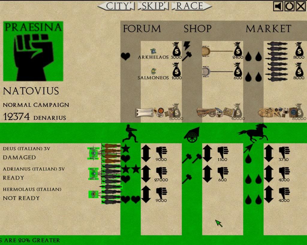
Everything looks a bit squashed up.
Also you can see each of the bags of money for the shops overlap with the goods icons.
This screen is actually rather badly laid out really, very large icons and a massive faction image that arent necessary at that size at all take up room that could be used to spread things out a bit better.