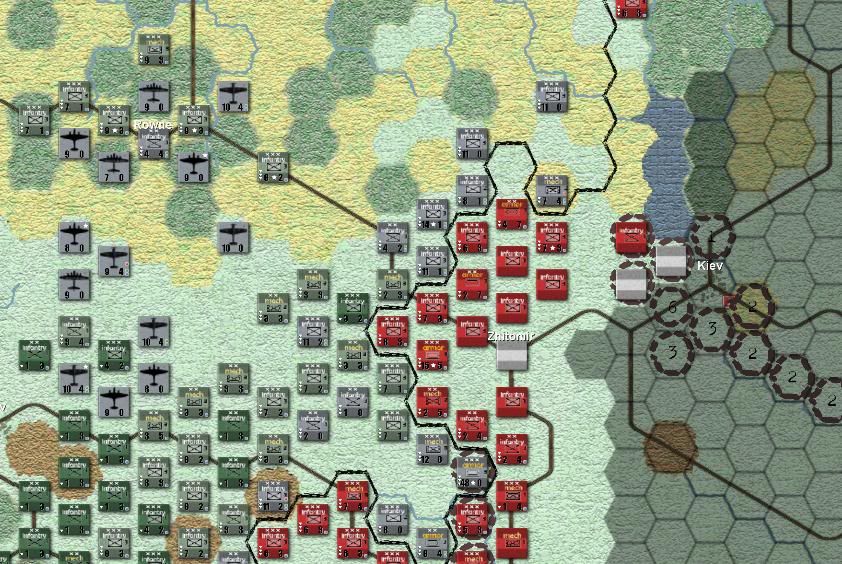
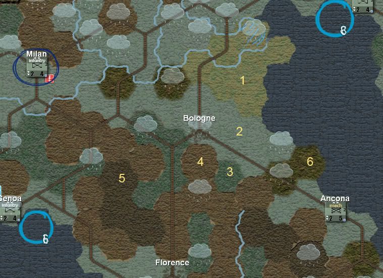
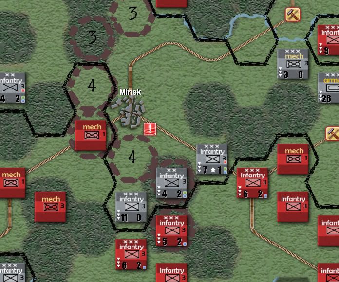
Really, really, really like what you've done with the units! [&o]
Map textures, not so much. [>:]
Excellent work.
Phil
Author, Space Opera (FGU); RBB #1 (FASA); Road to Armageddon; Farm, Forge and Steam; Orbis Mundi; Displaced (PGD)
----------------------------------------------
Email: aspqrz@tpg.com.au
I applaud your efforts. Interesting look. If I may offer some constructive criticism: to me, the use of that texture across all terrain types makes the map look a bit cartoonish, with not enough contrast between for example, plains and rough terrain.
Keep an eye on your unit levels, once you have a level 4 unit, you will have 3 triangles on the right and one little triangle on the right side of the icon and hence would overlap with your status indicators there.
Consider using numbers for level instead of the triangle icons. Thats what I did on my modified Counters Combination Mod unit icons. See Agent S' orginal and modified unit mods in this subforum to see how it is done.
Looks really nice, though as you have the nato symbol on the counters I don't think you need the text description and I'm not sure how readable the text will be once you start zooming out, nice looking though.
"In War: Resolution. In Defeat: Defiance. In Victory: Magnanimity. In Peace: Goodwill." - Winston Churchill