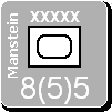
I have added the country abbreviations for all land units except the major powers (e.g., UK, USA, USSR, ..). I tried it for them too, but it was too much. I have made all the colors of the surrounding text match (in these cases either white or black) so it is easier to tell the elite, white print units from the others at a glance.
In my opinion it is much better this way (all canadians having the yellow & red box).
However, I feel that the country abbreviation is much much too big.
It should be in my opinion of the same font size as the designation of the unit.
As for the abbreviations, even if you used the olympic ones (it was a great idea), I think you should document this into the game documentation & help system. The variety of countries can be confusing.
Anyway, congratulations for the work on the counters, thay are great !!!
Now we have to see how the naval & air units come up when the graphic artist has finished. I think it will be even greater !!! [:D]
Also, to tell it again, I think that the units would be definitively terrific if they had a tiny 3-d touch, with even a slim shade added to them (as in this screen shot of SSG's most excellent "Battles in Italy" game.


