Unit Depictions on Screen

World in Flames is the computer version of Australian Design Group classic board game. World In Flames is a highly detailed game covering the both Europe and Pacific Theaters of Operations during World War II. If you want grand strategy this game is for you.

Moderator: Shannon V. OKeets

Shannon V. OKeets
Posts: 22165
Joined: Wed May 18, 2005 11:51 pm
Location: Honolulu, Hawaii
Contact:

RE: Unit Depictions on Screen

Post by Shannon V. OKeets »

ORIGINAL: pak19652002

I'm another member of this forgotten minority and have raised this issue several times in the past. Steve has assured me that Matrix publishes its games in full compliance with the Americans with Disabilities Act.[;)]

In other words, he promised to make important information available in ways color blind people can perceive.

So, how do the counters look to you? Should I try to put certain units next to each other?
Steve

Perfection is an elusive goal.
User avatar
Froonp
Posts: 7998
Joined: Tue Oct 21, 2003 8:23 pm
Location: Marseilles, France
Contact:

RE: Unit Depictions on Screen

Post by Froonp »

The Canadians. Next on my list is to add the letters CA to the right of the NATO symbol, rotated 90 degrees. The color will be yellow. I will do the same for all the Commonwealth member nations: NZ, AU, IN, SA, and UK.

I had to choose between two conflicting standards here: (1) white print units get white interiors and (2) Canadians get yellow interiors. I went with the white interiors and I am adding the letters to compensate for the linformation that is lost by not using yellow.
My opinion : I don't like it.
I prefer the Canadians with their yellow box, included the white print units.
They stand out perfectly from the other CW units being Yellow.

Edit : There are lots of countries that have a non standard inside box color, and all white print units for those countries keep their non standard color because it is more important to have the small army of a country looks the same (to better recognize them) rather than have the white prints be white. Czechoslovakia, All CW countries except UK, Chinese Communists, Poland (interior is white for all anyway), Sweden, Greece.

Edit 2 : Please consider leaving those minors' elite unit with their untouched box color, and add a golden star on all elite unit so that they all uniformely stand out from the rest.
User avatar
Froonp
Posts: 7998
Joined: Tue Oct 21, 2003 8:23 pm
Location: Marseilles, France
Contact:

RE: Unit Depictions on Screen

Post by Froonp »

Here are revised units for the Japanese. I have replaced the divisional interiors. I tried Patrice's pink but it was a disaster. The red just overwhelmed it. The more neutral pale yellow works ok. I lightened the interior of the corp units though not by much. When I made them too bright, they looked the same as the basic red for Japan and the interior disappeared. The militia symbol is more legible here
My opinion :
The black print units's interiors should be slightly slightly darker.
I do not like the DIV interior being green, seems like MAR units. But it may be my tastes. And as you know, I prefer it as the cardboard WiF.

Edit : For being constructive and not only criticize, I'd add that the Japanese DIV box should be some red hue of any kind, but greenish yellow is too far from that for me.
User avatar
Froonp
Posts: 7998
Joined: Tue Oct 21, 2003 8:23 pm
Location: Marseilles, France
Contact:

RE: Unit Depictions on Screen

Post by Froonp »

I replaced the red from the counter sheets with yellow. I just couldn't get the red bright enough to be seen as lower resolutions. The black surrounding it seemed to absorb it visually. The yellow might take some getting use to for those of you expecting red. However, the numbers are clearly visible now even when zooming out to 100%. No more squinting and eye strain.
Well, I'm not convicted by the yellow here neither. It is too close to the white for me.
Maybe try blue ?

Otherwise those German units looks great to me [:D].
Shannon V. OKeets
Posts: 22165
Joined: Wed May 18, 2005 11:51 pm
Location: Honolulu, Hawaii
Contact:

RE: Unit Depictions on Screen

Post by Shannon V. OKeets »

ORIGINAL: Froonp
My opinion :
The black print units's interiors should be slightly slightly darker.
I do not like the DIV interior being green, seems like MAR units. But it may be my tastes. And as you know, I prefer it as the cardboard WiF.

I just finished lightened it - slightly, slightly lighter. The black on dark red was too hard to see when zoomed out.

There is no green for the Japanese except for the marine units. The Japanese interior divisional color is a pale yellow (I know that because it is taken from CorelDraw's definition of pale yellow). In fact, it is the same interior color I used for the Nationist Chinese and the Russian divisional units.
Steve

Perfection is an elusive goal.
JanSorensen
Posts: 2536
Joined: Sun May 01, 2005 10:18 pm
Location: Aalborg, Denmark

RE: Unit Depictions on Screen

Post by JanSorensen »

I concur about the Canadians - their interior should remain yellow also for the white print units. The white is told by the color of the numbers well enough.
User avatar
Froonp
Posts: 7998
Joined: Tue Oct 21, 2003 8:23 pm
Location: Marseilles, France
Contact:

RE: Unit Depictions on Screen

Post by Froonp »

ORIGINAL: Glen Felzien
The counter sheets have SS units with white lettering and red lettering. The white are elite, the red aren't. In the rules, the term "white print unit" means elite and there are different rules for them concerning their strength when out of supply.
Ah ok, things have changed since I last played. The SS units where valued due to them all be white print but the game has evolved much since then.
In fact, it first came from the DIV SS who were not white print, and then a bunch of new SS units appeared (City volunteer) from which most are not units. Except those, the "regular" SS corps units are all elite.

I add here too in case Steve did not see my edit of my commentary to Canadian units :
Steve, please consider leaving those minors' elite unit and the CW home countries (except the UK ones) with their untouched box color, and add a golden star on all elite unit so that they all uniformely and consistantly stand out from the rest.
Shannon V. OKeets
Posts: 22165
Joined: Wed May 18, 2005 11:51 pm
Location: Honolulu, Hawaii
Contact:

RE: Unit Depictions on Screen

Post by Shannon V. OKeets »

ORIGINAL: Froonp
I replaced the red from the counter sheets with yellow. I just couldn't get the red bright enough to be seen as lower resolutions. The black surrounding it seemed to absorb it visually. The yellow might take some getting use to for those of you expecting red. However, the numbers are clearly visible now even when zooming out to 100%. No more squinting and eye strain.
Well, I'm not convicted by the yellow here neither. It is too close to the white for me.
Maybe try blue ?

Otherwise those German units looks great to me [:D].


The similarity between the yellow and white is a problem. But blue seems too far a jump for a German SS color - I hestitated using yellow.

The trouble is the black. The basic unit rectangle is quite large relative to the interior of the NATO symbol. Any color that is not bright enough becomes engulfed by the black and appears much darker than it would against a lighter background. That forces us to use bright colors and they have a tendency to appear white next to the black. For example, when I used pure red (in order to mimic the cardboard counters) it is 255, 0, 0 in RGB terms. White is 255, 255, 255. And yellow is 0,255,255. I am not sure whether the the brightness increases linearly or as the square of the magnitude (probably the former), but I do know that the red diappears and the yellow stands out. Of course the white is best of all because it has maximum contrast (contrast is difference in brightness). This is a problem not only for the SS, Belgians, and Afghan (all have black as their national color) but also for the Netherlands and a few other minor countries that have very dark national colors.

I'll try toning down the brightness of the yellow and see what affect that has.
Steve

Perfection is an elusive goal.
User avatar
Froonp
Posts: 7998
Joined: Tue Oct 21, 2003 8:23 pm
Location: Marseilles, France
Contact:

RE: Unit Depictions on Screen

Post by Froonp »

ORIGINAL: Shannon V. OKeets
ORIGINAL: Froonp
My opinion :
The black print units's interiors should be slightly slightly darker.
I do not like the DIV interior being green, seems like MAR units. But it may be my tastes. And as you know, I prefer it as the cardboard WiF.

I just finished lightened it - slightly, slightly lighter. The black on dark red was too hard to see when zoomed out.

There is no green for the Japanese except for the marine units. The Japanese interior divisional color is a pale yellow (I know that because it is taken from CorelDraw's definition of pale yellow). In fact, it is the same interior color I used for the Nationist Chinese and the Russian divisional units.
True, no green, only Yellow. I don't know why I wrote green. Maybe I'm a colorblind without knowing ???
Anyway, for the box interiors, I'd prefer them darker (as in post #15) and for the DIV, I'd prefer it to be a red hue. DIV interior is normaly a variant of the country color.

By the way, why are you doing all this complicated picture conversion stuff you wrote about : BMP to ??? to JPG. Can't you make it directly BMP to JPG ? JPG & BMP are the same (or I thought they were), except that JPG is compressed, but basicaly they are the same. There should be not conversion problem going from BMP to JPG directly.
User avatar
Froonp
Posts: 7998
Joined: Tue Oct 21, 2003 8:23 pm
Location: Marseilles, France
Contact:

RE: Unit Depictions on Screen

Post by Froonp »

The similarity between the yellow and white is a problem. But blue seems too far a jump for a German SS color - I hestitated using yellow.

The trouble is the black. The basic unit rectangle is quite large relative to the interior of the NATO symbol. Any color that is not bright enough becomes engulfed by the black and appears much darker than it would against a lighter background. That forces us to use bright colors and they have a tendency to appear white next to the black. For example, when I used pure red (in order to mimic the cardboard counters) it is 255, 0, 0 in RGB terms. White is 255, 255, 255. And yellow is 0,255,255. I am not sure whether the the brightness increases linearly or as the square of the magnitude (probably the former), but I do know that the red diappears and the yellow stands out. Of course the white is best of all because it has maximum contrast (contrast is difference in brightness). This is a problem not only for the SS, Belgians, and Afghan (all have black as their national color) but also for the Netherlands and a few other minor countries that have very dark national colors.

I'll try toning down the brightness of the yellow and see what affect that has.
Usually when I have this problem (seeing red writing out of black background), I use bold font.
Is it possible to use a bold font, and so keep red color for the writing ?
Shannon V. OKeets
Posts: 22165
Joined: Wed May 18, 2005 11:51 pm
Location: Honolulu, Hawaii
Contact:

RE: Unit Depictions on Screen

Post by Shannon V. OKeets »

ORIGINAL: JanSorensen

I concur about the Canadians - their interior should remain yellow also for the white print units. The white is told by the color of the numbers well enough.

[X(]Uh, oh. They're ganging up on me.

When I get the letters added I'll post screens shots both with (1) white and (2) yellow elite unit interiors for the Canadians.

In looking over the units again I see I should use two or three letter abbreviations for the Commonwealth member nations: CAN, AUS, IND, SA, NZ, and UK (colored yellow, red, green, orangish, white, and black respectively). These will just be for the land units. Space is at too great a premium for the air and naval units.

Hey, any body who agrees with me could say so too![8|]
Steve

Perfection is an elusive goal.
User avatar
Froonp
Posts: 7998
Joined: Tue Oct 21, 2003 8:23 pm
Location: Marseilles, France
Contact:

RE: Unit Depictions on Screen

Post by Froonp »

ORIGINAL: Shannon V. OKeets
ORIGINAL: JanSorensen
I concur about the Canadians - their interior should remain yellow also for the white print units. The white is told by the color of the numbers well enough.
[X(]Uh, oh. They're ganging up on me.
When I get the letters added I'll post screens shots both with (1) white and (2) yellow elite unit interiors for the Canadians.
In looking over the units again I see I should use two or three letter abbreviations for the Commonwealth member nations: CAN, AUS, IND, SA, NZ, and UK (colored yellow, red, green, orangish, white, and black respectively). These will just be for the land units. Space is at too great a premium for the air and naval units.
Hey, any body who agrees with me could say so too![8|]
Please, put a golden star in the top right corner of Elite units, and keep the boxes as they are [&o].
Image
Attachments
GoldenStar.jpg
GoldenStar.jpg (10.09 KiB) Viewed 265 times
Shannon V. OKeets
Posts: 22165
Joined: Wed May 18, 2005 11:51 pm
Location: Honolulu, Hawaii
Contact:

RE: Unit Depictions on Screen

Post by Shannon V. OKeets »

ORIGINAL: Froonp
Steve, please consider leaving those minors' elite unit and the CW home countries (except the UK ones) with their untouched box color, and add a golden star on all elite unit so that they all uniformely and consistantly stand out from the rest.

Space is hard to come by. It was one of the reasons I did not push for denoting the elite units with a special symbol (e.g., star) earlier. I couldn't figure out where to put it. I first thought of placing it where the R is for reserve units, but of course the very first reserve unit I checked was also elite - arrgh.

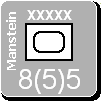
If you look at Manstein in the SS screen shot, you will see my problem. There isn't enough room after the 8(5)5 numbers. If I place it to the right of the NATO symbol, I lose the ability of giving the Commonwealth member nations their own lettering. And I had my heart set on that.

By the way, a yellow star won't always work (think of the Chinese), but matching the R (reserve) color would be ok.
Steve

Perfection is an elusive goal.
Shannon V. OKeets
Posts: 22165
Joined: Wed May 18, 2005 11:51 pm
Location: Honolulu, Hawaii
Contact:

RE: Unit Depictions on Screen

Post by Shannon V. OKeets »

ORIGINAL: Froonp
The similarity between the yellow and white is a problem. But blue seems too far a jump for a German SS color - I hestitated using yellow.

...

I'll try toning down the brightness of the yellow and see what affect that has.
Usually when I have this problem (seeing red writing out of black background), I use bold font.
Is it possible to use a bold font, and so keep red color for the writing ?

I am avoiding bold for the strength and movement numbers because it will change everything. I am already using it for the names, size (XXX) , and R (reserve).

I decided that the yellow is fine as it is for the SS non-elite units. The corps sized units all have black interiors so they are quite distinct from the elite SS units. Check the SS screen shot closely and you'll see that the elite and non-elite are markedly different.

And by the way, there is a mistake on the elite 8-4 unit, it's wheels have fallen off.

Steve

Perfection is an elusive goal.
Shannon V. OKeets
Posts: 22165
Joined: Wed May 18, 2005 11:51 pm
Location: Honolulu, Hawaii
Contact:

RE: Unit Depictions on Screen

Post by Shannon V. OKeets »

ORIGINAL: Froonp

By the way, why are you doing all this complicated picture conversion stuff you wrote about : BMP to ??? to JPG. Can't you make it directly BMP to JPG ? JPG & BMP are the same (or I thought they were), except that JPG is compressed, but basicaly they are the same. There should be not conversion problem going from BMP to JPG directly.

And the software for converting BMP directly to JPEG is?
Steve

Perfection is an elusive goal.
Shannon V. OKeets
Posts: 22165
Joined: Wed May 18, 2005 11:51 pm
Location: Honolulu, Hawaii
Contact:

RE: Unit Depictions on Screen

Post by Shannon V. OKeets »

ORIGINAL: Froonp
Please, put a golden star in the top right corner of Elite units, and keep the boxes as they are [&o].
Image

Nice star. A tad large for the counters.

Top right corner is holding the R for reserve right now. I moved it up so I would have room for the Commonwealth member nation abbreviations.
Steve

Perfection is an elusive goal.
User avatar
Froonp
Posts: 7998
Joined: Tue Oct 21, 2003 8:23 pm
Location: Marseilles, France
Contact:

RE: Unit Depictions on Screen

Post by Froonp »

Top Right Corner Elite Golden Star :
Well, there is barely the space for a dot the same size as the ART dot, this is not much this is true.
So, why not test a golden counter outline (yellow for non yellow units, orange for yellow units) for Elite units ?

Well, as someone previously said, having the factors being white print may also be enough, may not it ?

***********************************************
As a last note & suggestion about this issue :

The difference between elite & non elite is that elite units when disrupted and out of supply have 3 combat factors, and non elite disrupted & out of supply units have 1 combat factors.

Why not having those modified combat factors actually be written on the counter when the proper conditions are here ?

It is also true with not self-propelled ART units, when they are alone they are worth 1 combat factors if attacked. But they keep their combat factors for bombarding purposes for example, so maybe this won't be a good idea for them.

Also, disrupted units and out of supply units can't attack, so why not grey out their combat factors when units are disrupted or out of supply to show that ?

Well, I realize that this may be too much, but these are just ideas that I give you as they come, aren't we here for that ?
User avatar
Froonp
Posts: 7998
Joined: Tue Oct 21, 2003 8:23 pm
Location: Marseilles, France
Contact:

RE: Unit Depictions on Screen

Post by Froonp »

And the software for converting BMP directly to JPEG is?
You can download any free picture program out on the web who will undoubtely allow you to "save as" any opened picture as JPG.
I use "Photofiltre" myself (http://www.photofiltre.com/). You can tune the degree of compression to allow to loose less quality. 80-90% quality is good. However, you can tune this & the picture size each time to go under the 200kb limit of this forum.
User avatar
Froonp
Posts: 7998
Joined: Tue Oct 21, 2003 8:23 pm
Location: Marseilles, France
Contact:

RE: Unit Depictions on Screen

Post by Froonp »

Nice star. A tad large for the counters.

Top right corner is holding the R for reserve right now. I moved it up so I would have room for the Commonwealth member nation abbreviations.
Yes, too large, but I put it here to show you an example of the shades of colors that could lead to the "elite" effect.
For the top right corner, maybe you can put the "R" and the "CW member nation" both to the right of the NATO symbol, one on top of the other, to leave room for a nice tiny star for elite units on the top right corner ? [:D]
Shannon V. OKeets
Posts: 22165
Joined: Wed May 18, 2005 11:51 pm
Location: Honolulu, Hawaii
Contact:

RE: Unit Depictions on Screen

Post by Shannon V. OKeets »

ORIGINAL: Froonp

Top Right Corner Elite Golden Star :
Well, there is barely the space for a dot the same size as the ART dot, this is not much this is true.
So, why not test a golden counter outline (yellow for non yellow units, orange for yellow units) for Elite units ?

Well, as someone previously said, having the factors being white print may also be enough, may not it ?

***********************************************
As a last note & suggestion about this issue :

The difference between elite & non elite is that elite units when disrupted and out of supply have 3 combat factors, and non elite disrupted & out of supply units have 1 combat factors.

Why not having those modified combat factors actually be written on the counter when the proper conditions are here ?

It is also true with not self-propelled ART units, when they are alone they are worth 1 combat factors if attacked. But they keep their combat factors for bombarding purposes for example, so maybe this won't be a good idea for them.

Also, disrupted units and out of supply units can't attack, so why not grey out their combat factors when units are disrupted or out of supply to show that ?

Well, I realize that this may be too much, but these are just ideas that I give you as they come, aren't we here for that ?

White print numbers with white NATO interiors for all elite units should be be enough to distinguish them from their regular army counterparts. It is only the Commonwealth member nations that present a problem and that is because several of you would like to make their NATO interiors match what is on the counter sheets (a good and noble thing to do since the counter sheet versions are beautiful). I am trying to accommodate that desire but these past couple of dozen posts should give you an idea of what all the contraints there are in choosing colors.

Off on the horizon is the issue of the status boxes, the choice of their colors and other manipulations to convey come of the items you mentioned.

And, oh yeah, baby,[&o] I need the group's ideas and observtions or I would have driven this design off the road (over a cliff) (down a steep ravine) (into the ocean) (and washed out to sea) (with nothing but a few bubbles leaking to the surface through a lonely oil slick) (while cardboard counters are tossed about in the froth of the waves) long ago. When we get around to the status boxes we can strain the brain again.
Steve

Perfection is an elusive goal.
Post Reply

Return to “World in Flames”