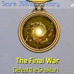
ZeroSum, the text in your screenshot looks pretty much identical to mine. The issue is probably monitors/eyesight. Although I have no issue reading the text, in the process of closely examining it I have achieved a greater appreciation for how its clarity could be improved. Rather than just being a matter of fonts the shadow effect behind the text might be detracting from legibility. It does add a little to the aesthetics but I'm not sure anyone could argue it makes it easier to read (except that with a picture in the background it makes it easier to distinguish text from picture). That it is greyish text on a greyish background doesn't help either.
I have attached a blown up version of my previous screenshot (although I am now using jpg I have confirmed it is an accurate representation by comparing with a zoomed in view of a raw screenshot) that makes it more obvious how indistinct the unbold text is. I have started messing around with replacing the text in that shot with a flatter white colour, I think that might make it much more legible.
I think that most fonts would probably still be hard to read when combined with those other considerations. It would suck if you got your wish and the font was replaced or the ability to substitute fonts was implemented but the text is still hard to read. There are at least three different things that might be getting in the way of easy reading:
font;
colour;
shadowing.
The default font used probably won't be changed. The ability to mod the game to use different fonts would be cool regardless of how much of a contribution it is making to illegibility. But be warned there is no way they can design the forms in such a way as to avoid all issues that different fonts might cause (mainly text overflow). There might be some room for improving the vanilla game regarding colour and shadowing in various areas. As how those are done depend on what area of the game you are talking about more feedback would be needed on what text is easy to read and what is causing issues.
Lol as I was writing this I came on an example of light blue text on a slightly darker blue transparent background in an empire flag. Although I can read it staring at it gives me a headache in short order.


