MWIF Game Interface Design

World in Flames is the computer version of Australian Design Group classic board game. World In Flames is a highly detailed game covering the both Europe and Pacific Theaters of Operations during World War II. If you want grand strategy this game is for you.

Moderator: Shannon V. OKeets

User avatar
Missouri_Rebel
Posts: 3062
Joined: Sun Jun 18, 2006 11:12 pm
Location: Southern Missouri

RE: MWIF Game Interface Design

Post by Missouri_Rebel »

I like the idea of letting players choose the look of their game to meet their taste. Most games offer very little in this aspect. Looks very good. One comment if I could;

Is there anyway to add some shading to those displays. The green and blue menus look rather plain imho, kind of 1980-ish. Some shading such as those arrows denoting ?attacks? would very much improve the look. Not that eye candy is all important, but it does help the appeal of fence-sitters.

My third post here and I am already asking for things. Must get aggravating. :)

Mo Reb


**Those who rob Peter to pay Paul can always count on the support of Paul
**A government big enough to give you everything you want is a government big enough to take from you everything you have-Gerald Ford
Shannon V. OKeets
Posts: 22165
Joined: Wed May 18, 2005 11:51 pm
Location: Honolulu, Hawaii
Contact:

RE: MWIF Game Interface Design

Post by Shannon V. OKeets »

ORIGINAL: Missouri_Rebel
I like the idea of letting players choose the look of their game to meet their taste. Most games offer very little in this aspect. Looks very good. One comment if I could;

Is there anyway to add some shading to those displays. The green and blue menus look rather plain imho, kind of 1980-ish. Some shading such as those arrows denoting ?attacks? would very much improve the look. Not that eye candy is all important, but it does help the appeal of fence-sitters.

My third post here and I am already asking for things. Must get aggravating. :)

Mo Reb

Not a problem. Things left unsaid are never heard.

The colors for the forms are all simply placeholders waiting for Rob to give me improved versions.

The map graphics are done (except for forts and weather) and so are the high resolution units. I am making changes to the medium resolution silhouettes using ones that Patrice sent me, but otherwise they are complete too.

For the forms, the 2 immediate screen shots above are the first that I have shown from Rob. That means the colors and borders are close to finished. The choice of font has still to be worked out. For instance, I expect to replace what was shown in the 2 screen shots above with a larger font size to make everything easier to read. Also , these were just drafts, they were not generated by the program, so the text has been scanned and rescanned several times introducing fuzziness. If you look at the counters, and compare it to other screen shots, you can see the distortion.
Steve

Perfection is an elusive goal.
User avatar
Missouri_Rebel
Posts: 3062
Joined: Sun Jun 18, 2006 11:12 pm
Location: Southern Missouri

RE: MWIF Game Interface Design

Post by Missouri_Rebel »

If I was unclear let me say that I meant those in post 434 and 435. The two immediate screens with the nice borders look excellent! Am I to assume that all of  the interface will have this same degree of high detail? If so I am very impressed. Great work and definately count me in for a copy.

Thanks for your valuable time,
Mo Reb
**Those who rob Peter to pay Paul can always count on the support of Paul
**A government big enough to give you everything you want is a government big enough to take from you everything you have-Gerald Ford
Shannon V. OKeets
Posts: 22165
Joined: Wed May 18, 2005 11:51 pm
Location: Honolulu, Hawaii
Contact:

RE: MWIF Game Interface Design

Post by Shannon V. OKeets »

ORIGINAL: Missouri_Rebel
If I was unclear let me say that I meant those in post 434 and 435. The two immediate screens with the nice borders look excellent! Am I to assume that all of  the interface will have this same degree of high detail? If so I am very impressed. Great work and definately count me in for a copy.

Thanks for your valuable time,
Mo Reb
There is a trade off between pretty borders and foot print size. For the forms that will 'float' on top of the detailed map and remain visible most of the time, I am striving for minimal borders so more of the map is visible. I post screen shots as things progress with the purpose of soliciting comments yay and nay.
Steve

Perfection is an elusive goal.
Shannon V. OKeets
Posts: 22165
Joined: Wed May 18, 2005 11:51 pm
Location: Honolulu, Hawaii
Contact:

RE: MWIF Game Interface Design

Post by Shannon V. OKeets »

Here is my first successful use of the skins that Rob has provided: the Distance Calculator. I try to start with the easiest and work my way up to the most difficult. In this case there are 104 forms to convert.

What you see is the USSR color scheme including the USSR flag in the title bar. For the other major powers the basic background color and title bar will change, but the buttons and labels and other little stuff will be the same.

For this form I want to make all the font sizes larger and I will probably rearrange the layout some more too.

Note the color change on the button when the cursor is over it: the Close button is the same design as the To Sea Area button.

Image
Attachments
DistanceC..42006..jpg
DistanceC..42006..jpg (294.63 KiB) Viewed 166 times
Steve

Perfection is an elusive goal.
User avatar
Froonp
Posts: 7998
Joined: Tue Oct 21, 2003 8:23 pm
Location: Marseilles, France
Contact:

RE: MWIF Game Interface Design

Post by Froonp »

Looks great !!!

Must also say that this distance calculator is great when reviewing the map, to compare to Google Earth distances, to see if the scale is consistent.
User avatar
Neilster
Posts: 2938
Joined: Mon Oct 27, 2003 1:52 pm
Location: Devonport, Tasmania, Australia

RE: MWIF Game Interface Design

Post by Neilster »

Looks good. My only suggestion would be to put some sort of frame or border around the flag to help it stand out. Perhaps it's just the Soviet one but it gets a bit lost in the title bar.

Cheers, Neilster
Cheers, Neilster
Shannon V. OKeets
Posts: 22165
Joined: Wed May 18, 2005 11:51 pm
Location: Honolulu, Hawaii
Contact:

RE: MWIF Game Interface Design

Post by Shannon V. OKeets »

ORIGINAL: Neilster
Looks good. My only suggestion would be to put some sort of frame or border around the flag to help it stand out. Perhaps it's just the Soviet one but it gets a bit lost in the title bar.

Cheers, Neilster

The Soviet flag is the most difficult because it only has a small amount of yellow for the crescent and stars, which makes the dark red pretty overwhelming. Another aspect of this is that we are intentionally making the top and bottom borders somewhat smaller than usual so the forms are more compact.

There are other places where the flags are more important and they are drawn much larger then (e.g., choice of land combat table). Here they are just glitz.
Steve

Perfection is an elusive goal.
User avatar
wfzimmerman
Posts: 338
Joined: Wed Oct 22, 2003 7:01 pm
Contact:

RE: MWIF Game Interface Design

Post by wfzimmerman »

ORIGINAL: Shannon V. OKeets

Here is my first successful use of the skins that Rob has provided: the Distance Calculator. I try to start with the easiest and work my way up to the most difficult. In this case there are 104 forms to convert.

What you see is the USSR color scheme including the USSR flag in the title bar. For the other major powers the basic background color and title bar will change, but the buttons and labels and other little stuff will be the same.

For this form I want to make all the font sizes larger and I will probably rearrange the layout some more too.

Note the color change on the button when the cursor is over it: the Close button is the same design as the To Sea Area button.

Image

How about a hyperlink on "air distance"? to a newb it's not obvious what the heck the difference is between distance and "air distance"?
Shannon V. OKeets
Posts: 22165
Joined: Wed May 18, 2005 11:51 pm
Location: Honolulu, Hawaii
Contact:

RE: MWIF Game Interface Design

Post by Shannon V. OKeets »

The Air Distance measure is different from the Distance measure because Distance simply counts the hexes - regardless of the terrain, ownership, or anything else. It merely uses the numbering scheme for the hexes to determine how far apart they are in the hexagonal grid.

Air Distance is how far an air unit would have to fly without crossing over neutral territory. For example, a German bomber in Dusseldorf would have to fly around Belgium and the Netherlands to bomb London (assuming both Belgium and the Netherlands were neutral). The Distance measure from Dusseldorf to London is only 7 hexes, while the Air Distance measure is 11 hexes.
Steve

Perfection is an elusive goal.
User avatar
Peter Stauffenberg
Posts: 403
Joined: Fri Feb 24, 2006 10:04 am
Location: Oslo, Norway

RE: MWIF Game Interface Design

Post by Peter Stauffenberg »

ORIGINAL: Shannon V. OKeets

The Air Distance measure is different from the Distance measure because Distance simply counts the hexes - regardless of the terrain, ownership, or anything else. It merely uses the numbering scheme for the hexes to determine how far apart they are in the hexagonal grid.

Air Distance is how far an air unit would have to fly without crossing over neutral territory. For example, a German bomber in Dusseldorf would have to fly around Belgium and the Netherlands to bomb London (assuming both Belgium and the Netherlands were neutral). The Distance measure from Dusseldorf to London is only 7 hexes, while the Air Distance measure is 11 hexes.

Is it possible to have a distance measure who counts the number of hexes along friendly rail lines?

Or walking on foot along controlled territory (the distance would be the number of MP's needed to get there). Let's say Russia wants to send a unit from Vladivostok to reinforce either the Leningrad area or the Moscow area. Or Russia wants to send a unit from the reserves to the front. Maybe this can be shown as arrows from hex to hex the path the unit has to move to get to the destination hex with the least number of MP's spent. Then we don't have to count and recount how to move certain units in order to find the shortest distance in MP's. The shortest distance in MP is not always the straight line to the hex. It has to walk in friendly controlled hexes and take into consideration terrain and unit type. A leg unit could use a different path than motorized units because of different terrain costs.

User avatar
wfzimmerman
Posts: 338
Joined: Wed Oct 22, 2003 7:01 pm
Contact:

RE: MWIF Game Interface Design

Post by wfzimmerman »

Excellent ideas.

MP cost would also have to take weather into consideration, which makes it more complicated, esp. if you are right about to switch seasons.  I envisage a dropdown toggle that lets you calculate MP with clear, rain, snow, etc.


Shannon V. OKeets
Posts: 22165
Joined: Wed May 18, 2005 11:51 pm
Location: Honolulu, Hawaii
Contact:

RE: MWIF Game Interface Design

Post by Shannon V. OKeets »

ORIGINAL: Borger Borgersen
ORIGINAL: Shannon V. OKeets
The Air Distance measure is different from the Distance measure because Distance simply counts the hexes - regardless of the terrain, ownership, or anything else. It merely uses the numbering scheme for the hexes to determine how far apart they are in the hexagonal grid.

Air Distance is how far an air unit would have to fly without crossing over neutral territory. For example, a German bomber in Dusseldorf would have to fly around Belgium and the Netherlands to bomb London (assuming both Belgium and the Netherlands were neutral). The Distance measure from Dusseldorf to London is only 7 hexes, while the Air Distance measure is 11 hexes.

Is it possible to have a distance measure who counts the number of hexes along friendly rail lines?

Or walking on foot along controlled territory (the distance would be the number of MP's needed to get there). Let's say Russia wants to send a unit from Vladivostok to reinforce either the Leningrad area or the Moscow area. Or Russia wants to send a unit from the reserves to the front. Maybe this can be shown as arrows from hex to hex the path the unit has to move to get to the destination hex with the least number of MP's spent. Then we don't have to count and recount how to move certain units in order to find the shortest distance in MP's. The shortest distance in MP is not always the straight line to the hex. It has to walk in friendly controlled hexes and take into consideration terrain and unit type. A leg unit could use a different path than motorized units because of different terrain costs.

I like the railroad addition, primarily because MWIF uses a fixed # of rail hexes as a "rail move" against the activity limit. It is now important for players to know how many "rail moves" are required to get from point A to B. For WIF FE, you simply looked at whether the unit started and ended on the same map.

I am not so keen on the foot movement stuff though. As Fred mentioned, there is both weather and unit type to consider (plus optional rules). Trying to calculate the distance from Cairo to Athens would be quite problemmatic. Also, I do not know about your restriction to hexes you control. Crossing enemy hexes would seem to be preferred whenever possible. There's stuff about enemy ZOC stopping movement. The list is probably longer if I really thought about it.

So, railroads yes, marching no.

And, in general, I believe that figuring out the best route to march a unit from A to B is an important part of playing WIF. I feel the players should be active in making decisions rather than watching an AI Assistant do things for them.
Steve

Perfection is an elusive goal.
User avatar
Zorachus99
Posts: 789
Joined: Fri Sep 15, 2000 8:00 am
Location: Palo Alto, CA

RE: MWIF Game Interface Design

Post by Zorachus99 »

ORIGINAL: Shannon V. OKeets
I am not so keen on the foot movement stuff though. As Fred mentioned, there is both weather and unit type to consider (plus optional rules). Trying to calculate the distance from Cairo to Athens would be quite problemmatic.

Are we going to see the possible hexs a unit can move to when we have a unit selected? That is a big want/need for me personally. Didn't the old beta have this feature?
Most men can survive adversity, the true test of a man's character is power. -Abraham Lincoln
User avatar
Froonp
Posts: 7998
Joined: Tue Oct 21, 2003 8:23 pm
Location: Marseilles, France
Contact:

RE: MWIF Game Interface Design

Post by Froonp »

ORIGINAL: Zorachus99
ORIGINAL: Shannon V. OKeets
I am not so keen on the foot movement stuff though. As Fred mentioned, there is both weather and unit type to consider (plus optional rules). Trying to calculate the distance from Cairo to Athens would be quite problemmatic.

Are we going to see the possible hexs a unit can move to when we have a unit selected? That is a big want/need for me personally. Didn't the old beta have this feature?
I second this. In the old CWiF Beta this didn't exist, but Chris always said that it would be included when he would have included the DirectDraw function, or I do not know what.

I hope this will exist in MWiF, this is a must have.
Shannon V. OKeets
Posts: 22165
Joined: Wed May 18, 2005 11:51 pm
Location: Honolulu, Hawaii
Contact:

RE: MWIF Game Interface Design

Post by Shannon V. OKeets »

ORIGINAL: Zorachus99
ORIGINAL: Shannon V. OKeets
I am not so keen on the foot movement stuff though. As Fred mentioned, there is both weather and unit type to consider (plus optional rules). Trying to calculate the distance from Cairo to Athens would be quite problemmatic.

Are we going to see the possible hexs a unit can move to when we have a unit selected? That is a big want/need for me personally. Didn't the old beta have this feature?

Yes.

This is different from what was being asked for previously in that the search is limited to the unit's movement allowance.
Steve

Perfection is an elusive goal.
Shannon V. OKeets
Posts: 22165
Joined: Wed May 18, 2005 11:51 pm
Location: Honolulu, Hawaii
Contact:

RE: MWIF Game Interface Design

Post by Shannon V. OKeets »

Here are two screen shots from the new interface using Theme Engine. This screen shot shows two forms at once. It is using the USSR graphics colors

The top is the review units forms which has a lot of information about each unit. The one under the cursor is the IL-4 with a blow up of the high resolution bitmap image, a little panel listing all the numbers associated with the unit, a text description, a mini-map at the bottom showing where the unit is on the map, and any note that has been attached to the unit by the player (here that is blank). The Soviet flag in the upper right corner of the form indicates that this is the active form.

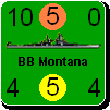
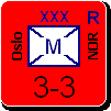
The second form, at the bottom of the screen shot, shot the setup tray for the USSR. There are two unit lists: the top lists is for air units while the bottom list serves a dual purpose - either land or naval. In the upper left are the 3 setup locations and underneath that are the detils of the current unit under the cursor (33 INF is not visible - it has been placed on the on map). The slew of buttons are for limiting which units are shown in the lists by subtype. For example, you could just look at the fighters - temporarily removing the land based bombers from the list.

What I need to clean up are:
1 - the scroll bar for the map is the old style (I have been trynig to fix that for the last 2 days)
2 - the high resolution image has some slop around the edges (an old problem I haven't gotten to yet)
3 - the background for the text is too dark for my liking (when Rob gets back from vacation, I'll have him change it)
4 - the close button has the old style image
5 - the fonts are too small in most places, for example: "Center linked map", "Player's Note", 'Filter'. (the other problem I have been trying to fix for 2 days).
6 - the placement of the units within the setup tray lists are too low; they need to be moved up 3 or 4 pixels.

Image
Attachments
ThemeEngin..620061.jpg
ThemeEngin..620061.jpg (288.07 KiB) Viewed 165 times
Steve

Perfection is an elusive goal.
Shannon V. OKeets
Posts: 22165
Joined: Wed May 18, 2005 11:51 pm
Location: Honolulu, Hawaii
Contact:

RE: MWIF Game Interface Design

Post by Shannon V. OKeets »

And here is the second/last in the series, using the German color scheme.

I am happy with this except for the small font sizes almost everywhere. Theme Engine has capabilities for varying the fonts but I haven't found the right sequence of incantations for changing them - I always get Tacoma size 8 in black.

Image
Attachments
ThemeEngin..620062.jpg
ThemeEngin..620062.jpg (225.19 KiB) Viewed 165 times
Steve

Perfection is an elusive goal.
Shannon V. OKeets
Posts: 22165
Joined: Wed May 18, 2005 11:51 pm
Location: Honolulu, Hawaii
Contact:

RE: MWIF Game Interface Design

Post by Shannon V. OKeets »

Here is my current version for the Start New Game form.

The sequence for entering your selections is:
1 - Italian section (mode of play)
2 - German section (scenario)
3 - Japanese section (optional rules)
3a - Chinese section (defaults for optional rules)
4 - French section (player names)
5 - Commonwealth section (assign major powers to players)

The MWIF Opening Screen form shows the color schemes and flags for the other major powers: USA and USSR. I am still cleaning up that layout - screen shot later. By the way, Germany appears on both forms.

Image
Attachments
ThemeEngin..620063.jpg
ThemeEngin..620063.jpg (167.78 KiB) Viewed 165 times
Steve

Perfection is an elusive goal.
User avatar
c92nichj
Posts: 345
Joined: Fri Jan 14, 2005 1:15 pm
Contact:

RE: MWIF Game Interface Design

Post by c92nichj »

I think the font size looks good on the screen shots, no need to increase it.
Post Reply

Return to “World in Flames”