No transparency or waving fans. That begins to sound like some sort of oriental dancing girl. And besides, there is enough work before me already without additions.ORIGINAL: Froonp
Well, I like both what Samurai proposed, and your B proposal.
What could be exciting (Vista thing) would be for the flyout to be semi transparent, allowing the counters to be seen in the flyout, but also keeping the on map situation in sight.
What is needed on the other hand is for some data about the stack to be displayed somehwere. The most important of them is the total land combat strengh of the stack. It could appear in the status bar, kind of what Excel show in the task bar (bottom grey row of the screen of Excel) when you select numbers. You right click in the task bar to ask Excel to see averages instead of sums, or standard deviations, or countings, well, your choice. MWiF could have the same kind of feature. Right click on it to choose to see total land combat strength, total tactical support factors, strat factors, max movement, or whatever.
About the flyout, I could also envision it spreading fan-like, showing all the units in the stack, the units overlapping a little (fan-like), and un-spreading when closing. [:D]
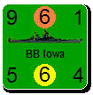
I don't think I will put any other info in either. If you are really interested in the atack values et al, just have the Units Under Cursor panel visible and you can get all that information updated as you move the mouse over different hexes. Flyouts is a supplement to, not replacement for, the UUC. I see its main advantages as: being able to find a specific unit you are looking for (the larger visual image will help for that), checking a stack to see that it has the types of units in it that you think it does (e.g., review prior to pressing the End of Phase button), a quick examination of a stack without having to flick your eyes over to the UUC.
The more we add to Flyouts the bulkier and more cumbersome they become.
---
I am still thinking seriously about splitting the unit data box out as a separate entity, which the player can position anywhere he wants. Right now it is enbedded in the UUC. As a floating box on the screen this could fulfill your request without requiring the full footprint of the UUC. I'll see how things go in this evolving player interface.