There was a bug in one of the earlier versions that caused the wrong color for the font to be used at times (white when it should have been black). That is what you saw for "a variety of pastel background colors". That has since been fixed.ORIGINAL: lomyrin
I also agree on the readability of white print on grey as not being of enough contrast.
That goes for white print on a variety of pastel color backgrounds in other forms as well.
Lars
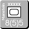
A white font is only used for the US, CW, and Germany. All the other major powers use a black font. For the US and CW white is clearly the better choice. Here is what Germany would look like using a black font. The trouble arises because Germany's gray is between white and black, making the contrast less than ideal.
I also haven't decided about the use of 'transparent' for some text labels. In this screenshot you see the caption about the map against a solid gray color, the same as for the notation in the scrollable unit list on the left and for the unit name at the top. In all those cases, I have no choice. Using the textured background isn't really feasible.
There are two other labels which have transparent backgrounds: the Player's Note and Filter. I could make those a solid color background too, but I am not really happy about the rectangular box effect around the label that results. Having the text 'float' on the page is better to my eye. But then I am unhappy about the sharpness of the text against the mottled background. Sigh.
Given your comment about the white, do you prefer black for Germany's font color?


