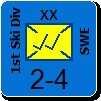
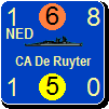
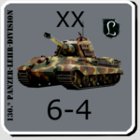
Custom changes to your counter mix

Post new mods and scenarios here.

Moderator: Shannon V. OKeets

User avatar
warspite1
Posts: 42108
Joined: Sat Feb 02, 2008 1:06 pm
Location: England

RE: Custom changes to your counter mix

Post by warspite1 »

ORIGINAL: Orm

ORIGINAL: warspite1

ORIGINAL: AxelNL


Yes, I did. Worked fine. Had Warspite in a fancy Italian stripe. Didn't look bad actually. Lend-lease mixing of colours went fine as well.
warspite1

WHAT!!! Fetch me my angry trousers - I'm madder than I've ever been...[:@]


[;)]
Do you have angry trousers?! [X(]

[:D]
warspite1

It's a line from a brilliant advert from last year.

http://www.youtube.com/watch?v=rMoaq76zzfM
Now Maitland, now's your time!

Duke of Wellington to 1st Guards Brigade - Waterloo 18 June 1815
User avatar
warspite1
Posts: 42108
Joined: Sat Feb 02, 2008 1:06 pm
Location: England

RE: Custom changes to your counter mix

Post by warspite1 »

ORIGINAL: AxelNL

ORIGINAL: warspite1

ORIGINAL: AxelNL


Yes, I did. Worked fine. Had Warspite in a fancy Italian stripe. Didn't look bad actually. Lend-lease mixing of colours went fine as well.
warspite1

WHAT!!! Fetch me my angry trousers - I'm madder than I've ever been...[:@]


[;)]

Can you not imaging how good you look when dressed in the latest fashion movement coming from Milan?
To spare your feelings I have only sent your brothers to the tailor....
warspite1

Brothers? These are ships AxelNL - feminine not masculine [:@]

The R-class battleships and the Renown-class battlecruisers are unloved step-kids in relation to the Queen Elizabeths [:-]

Last and no means least, remove that unsightly imagine immediately - the Royal Navy does not surrender to the Regia Marina!!!


[;)]
Now Maitland, now's your time!

Duke of Wellington to 1st Guards Brigade - Waterloo 18 June 1815
User avatar
Orm
Posts: 30303
Joined: Sat May 03, 2008 7:53 pm
Location: Sweden

RE: Custom changes to your counter mix

Post by Orm »

ORIGINAL: warspite1

ORIGINAL: Orm

ORIGINAL: warspite1


warspite1

WHAT!!! Fetch me my angry trousers - I'm madder than I've ever been...[:@]


[;)]
Do you have angry trousers?! [X(]

[:D]
warspite1

It's a line from a brilliant advert from last year.

http://www.youtube.com/watch?v=rMoaq76zzfM
Sheer brilliance. [:)][:D]

Unfortunately this saddens me when I compare with the adverts I am forced to endure. [:(]
Have a bit more patience with newbies. Of course some of them act dumb -- they're often students, for heaven's sake. - Terry Pratchett

A government is a body of people; usually, notably, ungoverned. - Quote from Firefly
User avatar
Orm
Posts: 30303
Joined: Sat May 03, 2008 7:53 pm
Location: Sweden

RE: Custom changes to your counter mix

Post by Orm »

ORIGINAL: warspite1

ORIGINAL: AxelNL

ORIGINAL: warspite1


warspite1

WHAT!!! Fetch me my angry trousers - I'm madder than I've ever been...[:@]


[;)]

Can you not imaging how good you look when dressed in the latest fashion movement coming from Milan?
To spare your feelings I have only sent your brothers to the tailor....
warspite1

Brothers? These are ships AxelNL - feminine not masculine [:@]

The R-class battleships and the Renown-class battlecruisers are unloved step-kids in relation to the Queen Elizabeths [:-]

Last and no means least, remove that unsightly imagine immediately - the Royal Navy does not surrender to the Regia Marina!!!


[;)]
Since all the RN ships are female should not HMS King George V have been named King Georgina V or even Queen Georgina V instead? [;)]

Would it not be weird and disrespectful to refer to a King as a she? [X(]
Have a bit more patience with newbies. Of course some of them act dumb -- they're often students, for heaven's sake. - Terry Pratchett

A government is a body of people; usually, notably, ungoverned. - Quote from Firefly
User avatar
warspite1
Posts: 42108
Joined: Sat Feb 02, 2008 1:06 pm
Location: England

RE: Custom changes to your counter mix

Post by warspite1 »

ORIGINAL: Orm

ORIGINAL: warspite1

ORIGINAL: AxelNL


Can you not imaging how good you look when dressed in the latest fashion movement coming from Milan?
To spare your feelings I have only sent your brothers to the tailor....
warspite1

Brothers? These are ships AxelNL - feminine not masculine [:@]

The R-class battleships and the Renown-class battlecruisers are unloved step-kids in relation to the Queen Elizabeths [:-]

Last and no means least, remove that unsightly imagine immediately - the Royal Navy does not surrender to the Regia Marina!!!


[;)]
Since all the RN ships are female should not HMS King George V have been named King Georgina V or even Queen Georgina V instead? [;)]

Would it not be weird and disrespectful to refer to a King as a she? [X(]
warspite1

Yes, I think we should re-name some of these; how about Frau Tirpitz and Frau Bismarck [:)]
Now Maitland, now's your time!

Duke of Wellington to 1st Guards Brigade - Waterloo 18 June 1815
User avatar
AxelNL
Posts: 2389
Joined: Sat Sep 24, 2011 12:43 pm
Location: The Netherlands

RE: Custom changes to your counter mix

Post by AxelNL »

ORIGINAL: warspite1

ORIGINAL: AxelNL

ORIGINAL: warspite1


warspite1

WHAT!!! Fetch me my angry trousers - I'm madder than I've ever been...[:@]


[;)]

Can you not imaging how good you look when dressed in the latest fashion movement coming from Milan?
To spare your feelings I have only sent your brothers to the tailor....
warspite1

Brothers? These are ships AxelNL - feminine not masculine [:@]

The R-class battleships and the Renown-class battlecruisers are unloved step-kids in relation to the Queen Elizabeths [:-]

Last and no means least, remove that unsightly imagine immediately - the Royal Navy does not surrender to the Regia Marina!!!


[;)]

I am so sorry, Warspite1. But did you not start with mentioning trousers? The fancy Italian stripe could have easily been on their skirts?

Your brethren (ok now?) were captured in a surprise invasion of Port Said, and supported two Regia Marina transporters in capturing many an atol/island around the Arabian sea in that particular game. They saw more action than they normally do in my games [8D]
User avatar
Orm
Posts: 30303
Joined: Sat May 03, 2008 7:53 pm
Location: Sweden

RE: Custom changes to your counter mix

Post by Orm »

ORIGINAL: warspite1

Yes, I think we should re-name some of these; how about Frau Tirpitz and Frau Bismarck [:)]
I do not think Germany consider their ships to be female.
Have a bit more patience with newbies. Of course some of them act dumb -- they're often students, for heaven's sake. - Terry Pratchett

A government is a body of people; usually, notably, ungoverned. - Quote from Firefly
User avatar
warspite1
Posts: 42108
Joined: Sat Feb 02, 2008 1:06 pm
Location: England

RE: Custom changes to your counter mix

Post by warspite1 »

ORIGINAL: Orm

ORIGINAL: warspite1

Yes, I think we should re-name some of these; how about Frau Tirpitz and Frau Bismarck [:)]
I do not think Germany consider their ships to be female.
warspite1

Is that right? I assumed all countries did - but never really thought to question it? I'll post a question in the GD forum. Interesting.
Now Maitland, now's your time!

Duke of Wellington to 1st Guards Brigade - Waterloo 18 June 1815
User avatar
WarHunter
Posts: 1174
Joined: Sun Mar 21, 2004 6:27 pm

RE: Custom changes to your counter mix

Post by WarHunter »

Now i know what "Fighting Trousers" are.
http://www.youtube.com/watch?v=0iRTB-FTMdk

Currently been working on the renaming air units. Its still a work in progress. Sneak peek.
This week I'll work on Japan turning Yellow. Then China.

Image
Attachments
testAUn.jpg
testAUn.jpg (51.75 KiB) Viewed 353 times
Image
“We never felt like we were losing until we were actually dead.”
Marcus Luttrell
User avatar
WarHunter
Posts: 1174
Joined: Sun Mar 21, 2004 6:27 pm

RE: Custom changes to your counter mix

Post by WarHunter »

ORIGINAL: Ichirou989
Oh yeah! Olive drab for the American forces. I remember I fiddled with this a bit, but I used a more green olive shade. I also seem to think of either yellow or red for the Japanese. Probably because of the board games I've played that used those colors for them.
You might like this for shades of Olive Drab.


Image
Attachments
colourchips.jpg
colourchips.jpg (93.83 KiB) Viewed 349 times
Image
“We never felt like we were losing until we were actually dead.”
Marcus Luttrell
User avatar
paulderynck
Posts: 8465
Joined: Sat Mar 24, 2007 5:27 pm
Location: Canada

RE: Custom changes to your counter mix

Post by paulderynck »

ORIGINAL: WarHunter

You might like this for shades of Olive Drab.

Image
Model Master 1711 is the right one. Even looks uniform cloth-like.
Paul
User avatar
WarHunter
Posts: 1174
Joined: Sun Mar 21, 2004 6:27 pm

RE: Custom changes to your counter mix

Post by WarHunter »

ORIGINAL: paulderynck
Model Master 1711 is the right one. Even looks uniform cloth-like.
That is also my favorite shade. It may not be the best choice for a counter background. [:(]
Its hard to find a good readable color that's not a shade of white.

I'm leaning more and more to a lighter shade of Model Master 4728 with a Model master 1711 as the fill-in for the NATO symbol.
Still it was worth looking at the various shades.

Image
Attachments
usaOD01.jpg
usaOD01.jpg (60.66 KiB) Viewed 351 times
Image
“We never felt like we were losing until we were actually dead.”
Marcus Luttrell
User avatar
AxelNL
Posts: 2389
Joined: Sat Sep 24, 2011 12:43 pm
Location: The Netherlands

RE: Custom changes to your counter mix

Post by AxelNL »

I like the BB Montana row very much! The lower row looks a bit German to me, could you put a German unit next to it?
User avatar
WarHunter
Posts: 1174
Joined: Sun Mar 21, 2004 6:27 pm

RE: Custom changes to your counter mix

Post by WarHunter »

ORIGINAL: AxelNL

I like the BB Montana row very much! The lower row looks a bit German to me, could you put a German unit next to it?
Here is the original German color and the mod colors being worked on. I'll get a Japan Yellow up later.

Image
Attachments
usgerm01.jpg
usgerm01.jpg (37.42 KiB) Viewed 353 times
Image
“We never felt like we were losing until we were actually dead.”
Marcus Luttrell
User avatar
paulderynck
Posts: 8465
Joined: Sat Mar 24, 2007 5:27 pm
Location: Canada

RE: Custom changes to your counter mix

Post by paulderynck »

Last two rows look quite good to me, but the US 7-5 shouldn't be a white print unit should it? Also it's surprising 4728 comes across that dark given the swatch in post 31.

If the US could be little lighter, maybe? (Of course we all need to keep in mind not all monitors are created equal so we may not all be seeing the exact same colors.)
Paul
User avatar
AxelNL
Posts: 2389
Joined: Sat Sep 24, 2011 12:43 pm
Location: The Netherlands

RE: Custom changes to your counter mix

Post by AxelNL »

ORIGINAL: paulderynck

Last two rows look quite good to me, but the US 7-5 shouldn't be a white print unit should it? Also it's surprising 4728 comes across that dark given the swatch in post 31.

If the US could be little lighter, maybe? (Of course we all need to keep in mind not all monitors are created equal so we may not all be seeing the exact same colors.)

For me the difference between the darker 7-5 print and the white 8-4 is good enough, but if that holds on the board without having the different units close for comparison...? Then again, one should focus on the interiour colour of the Nato box.

I still like the lower row very much for the US, the Bayerlein row is very Germanic. Reminds me of a German counterset of an old Avalon Hill - but which one?
User avatar
WarHunter
Posts: 1174
Joined: Sun Mar 21, 2004 6:27 pm

RE: Custom changes to your counter mix

Post by WarHunter »

ORIGINAL: AxelNL

ORIGINAL: paulderynck

Last two rows look quite good to me, but the US 7-5 shouldn't be a white print unit should it? Also it's surprising 4728 comes across that dark given the swatch in post 31.

If the US could be little lighter, maybe? (Of course we all need to keep in mind not all monitors are created equal so we may not all be seeing the exact same colors.)

For me the difference between the darker 7-5 print and the white 8-4 is good enough, but if that holds on the board without having the different units close for comparison...? Then again, one should focus on the interiour colour of the Nato box.

I still like the lower row very much for the US, the Bayerlein row is very Germanic. Reminds me of a German counterset of an old Avalon Hill - but which one?

The OD Green is really dark except for a couple of shades. Depending on the monitor in use, they do look lighter or darker.
I'll continue work with the last 2 rows. getting the anti-aliasing cleared up will be a project by itself. So many US counters.

The AH game you might be thinking of, back when the French were pinkish.


Image
Attachments
AH1914.jpg
AH1914.jpg (26.62 KiB) Viewed 353 times
Image
“We never felt like we were losing until we were actually dead.”
Marcus Luttrell
User avatar
Viktor_Kormel_slith
Posts: 372
Joined: Thu Nov 14, 2013 9:47 pm

RE: Custom changes to your counter mix

Post by Viktor_Kormel_slith »

Hi! Warhunter if you have a little spare time, I got a petition, could you change the painfull pink for spanish nationalists? Yes, I am spanish and its too hony to me. Some kind of gray, blue, olive or brown would be more acceptable.
Thanks for Khaki, is wonderfull!
Sorry, for my bad english! "Wiffing" since 1990 to the tomb!
User avatar
WarHunter
Posts: 1174
Joined: Sun Mar 21, 2004 6:27 pm

RE: Custom changes to your counter mix

Post by WarHunter »

ORIGINAL: Viktor_Kormel

Hi! Warhunter if you have a little spare time, I got a petition, could you change the painfull pink for spanish nationalists? Yes, I am spanish and its too hony to me. Some kind of gray, blue, olive or brown would be more acceptable.
Thanks for Khaki, is wonderfull!
Greetings Viktor,
I'll come up with something for you to look at and choose.
Image
“We never felt like we were losing until we were actually dead.”
Marcus Luttrell
User avatar
AxelNL
Posts: 2389
Joined: Sat Sep 24, 2011 12:43 pm
Location: The Netherlands

RE: Custom changes to your counter mix

Post by AxelNL »

ORIGINAL: WarHunter

ORIGINAL: AxelNL

ORIGINAL: paulderynck

Last two rows look quite good to me, but the US 7-5 shouldn't be a white print unit should it? Also it's surprising 4728 comes across that dark given the swatch in post 31.

If the US could be little lighter, maybe? (Of course we all need to keep in mind not all monitors are created equal so we may not all be seeing the exact same colors.)

For me the difference between the darker 7-5 print and the white 8-4 is good enough, but if that holds on the board without having the different units close for comparison...? Then again, one should focus on the interiour colour of the Nato box.

I still like the lower row very much for the US, the Bayerlein row is very Germanic. Reminds me of a German counterset of an old Avalon Hill - but which one?

The OD Green is really dark except for a couple of shades. Depending on the monitor in use, they do look lighter or darker.
I'll continue work with the last 2 rows. getting the anti-aliasing cleared up will be a project by itself. So many US counters.

The AH game you might be thinking of, back when the French were pinkish.


Image

Must have seen it somewhere and forgotten about it!
Post Reply

Return to “Mods and Scenarios”