Please keep in mind we are still in beta and these screens are not final, but you asked for a peek, so here it is. [8D]

Moderator: SeanD


ORIGINAL: Capitaine
The screens look pretty good to me, and the quality of the map art appears high....
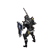
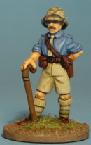
A couple of deficiencies strike me initially: (1) Counters: The basic, "typewriter" style font used for the text looks pretty weak. Something maybe a bit more substantial, and also adjust the text positioning as some of the numbers on the bottom of the units appear to be cut off. I also don't care for the "soldier art" on the shots here (and the ones in the earlier screens). The art quality of these images is too inconsistent across the board, and if this sort of depiction is desired I'd have another go at a different, more screen-friendly style.


I hope it has some good intro music at least to give a feeling of the era.